Deloitte Global
Designer
This project consists of design sequences created for a pitch, capturing the players’ raw energy and intensity on the training ground. Player cutouts are paired with big, bold typography to amplify key moments, while red and blue color accents reinforce the team’s identity and inject impact and momentum. Through aggressive pacing and graphic contrast, the visuals convey the grit, focus, and pressure of life inside the Buffalo Bills’ camp.
Design Sequence 1
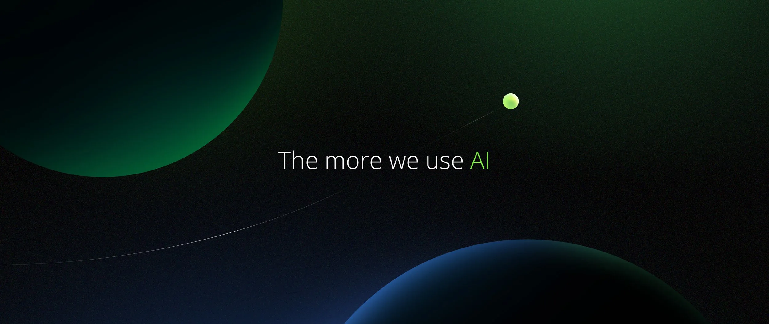
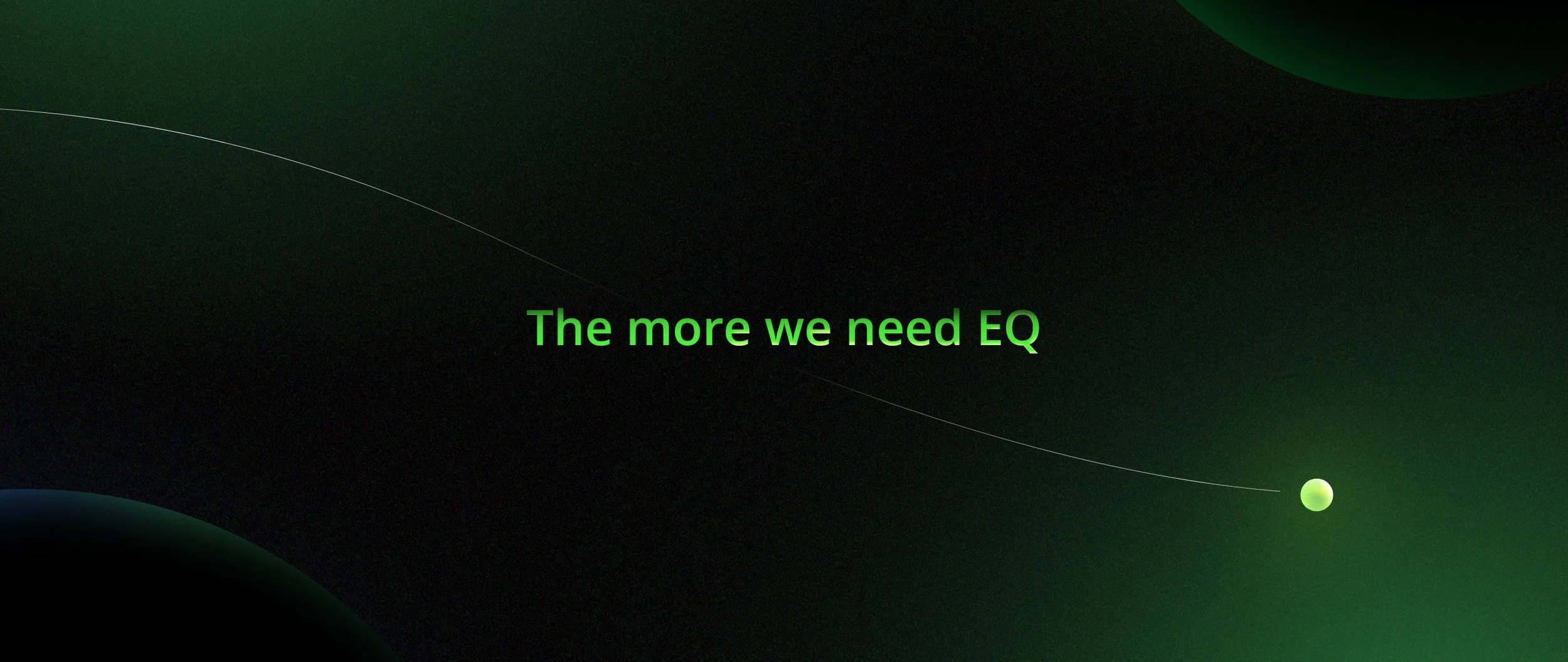
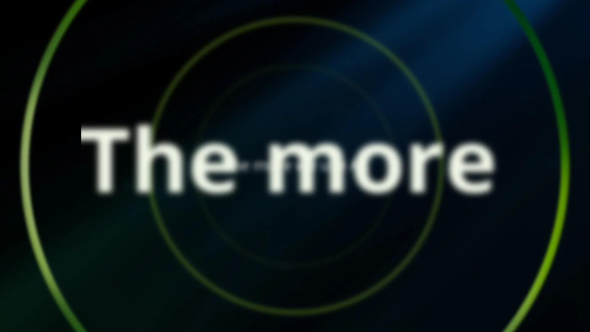
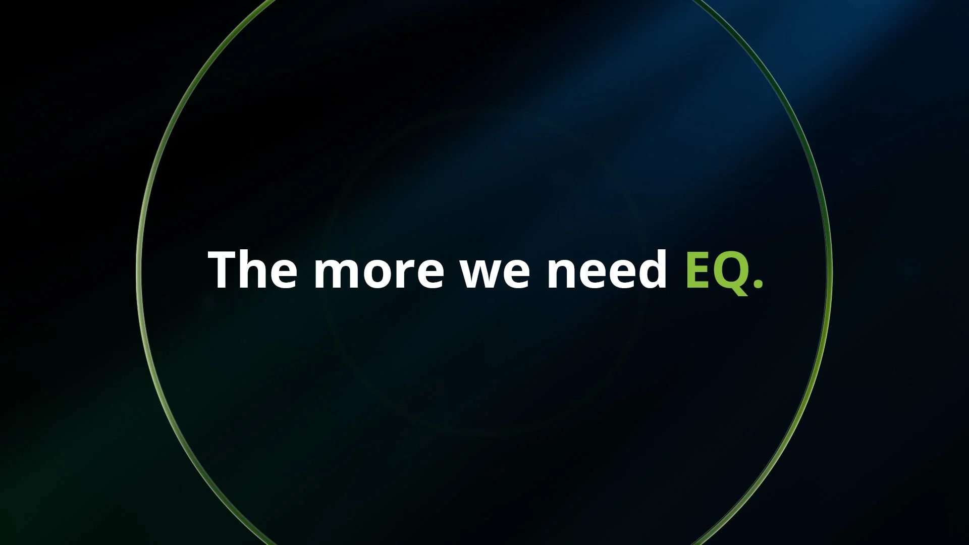
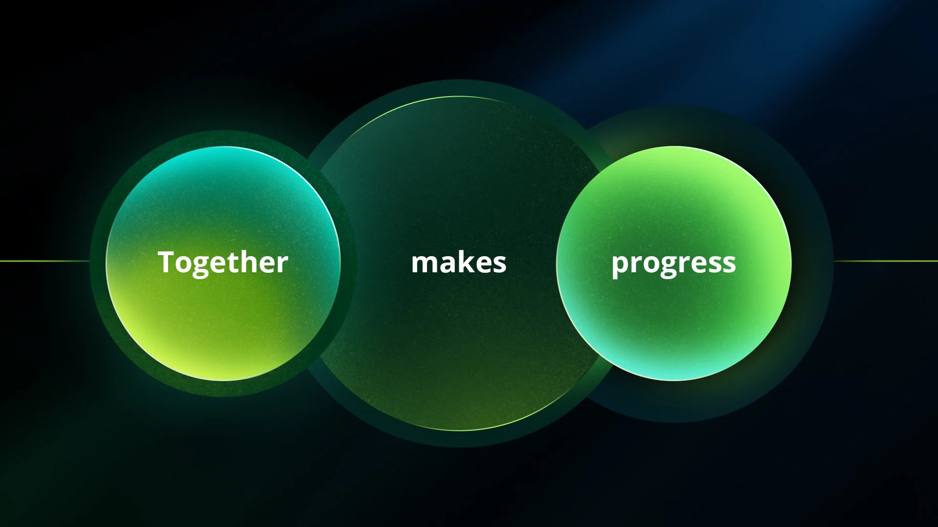
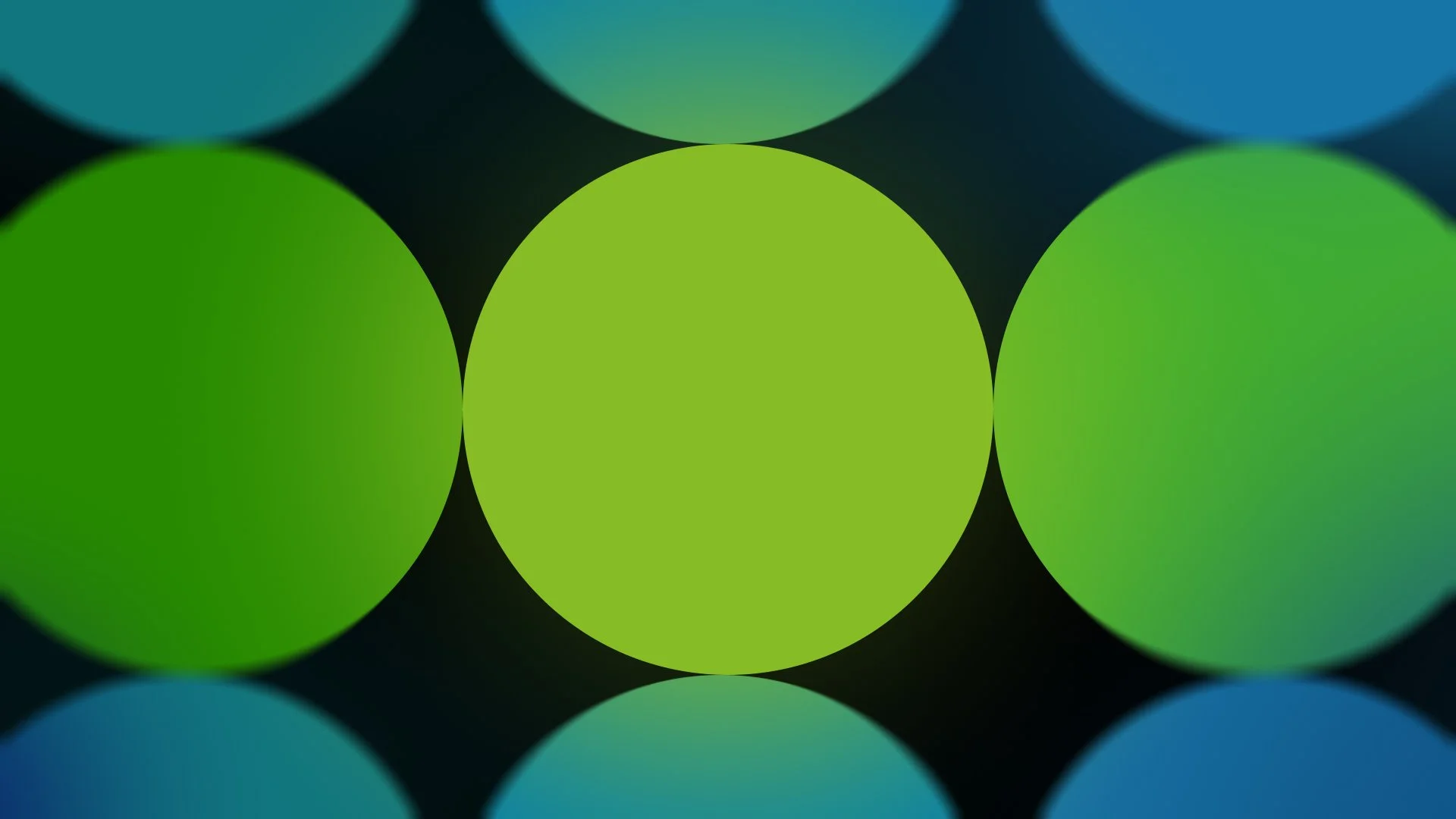
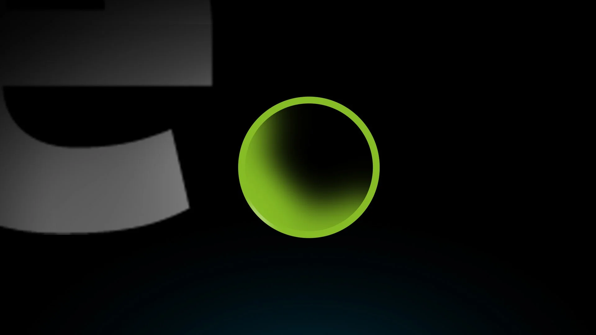
The approach was to communicate a complex idea in a simple, intuitive way through visual storytelling. We used soft, abstract spheres as the core visual language, allowing them to represent people, ideas, and systems without being literal. As these elements move, overlap, and connect, they visually reinforce the idea that progress is created through collaboration and balance.
The color palette leans into deep blues and greens with subtle gradients and texture to create a calm, modern tone that feels both human and technological. Typography is kept minimal and intentional so the focus stays on the motion and relationships between the forms. By having the shapes physically come together to reveal the final message, the visuals clearly and elegantly support Deloitte’s belief that progress is strongest when intelligence and empathy move forward together.

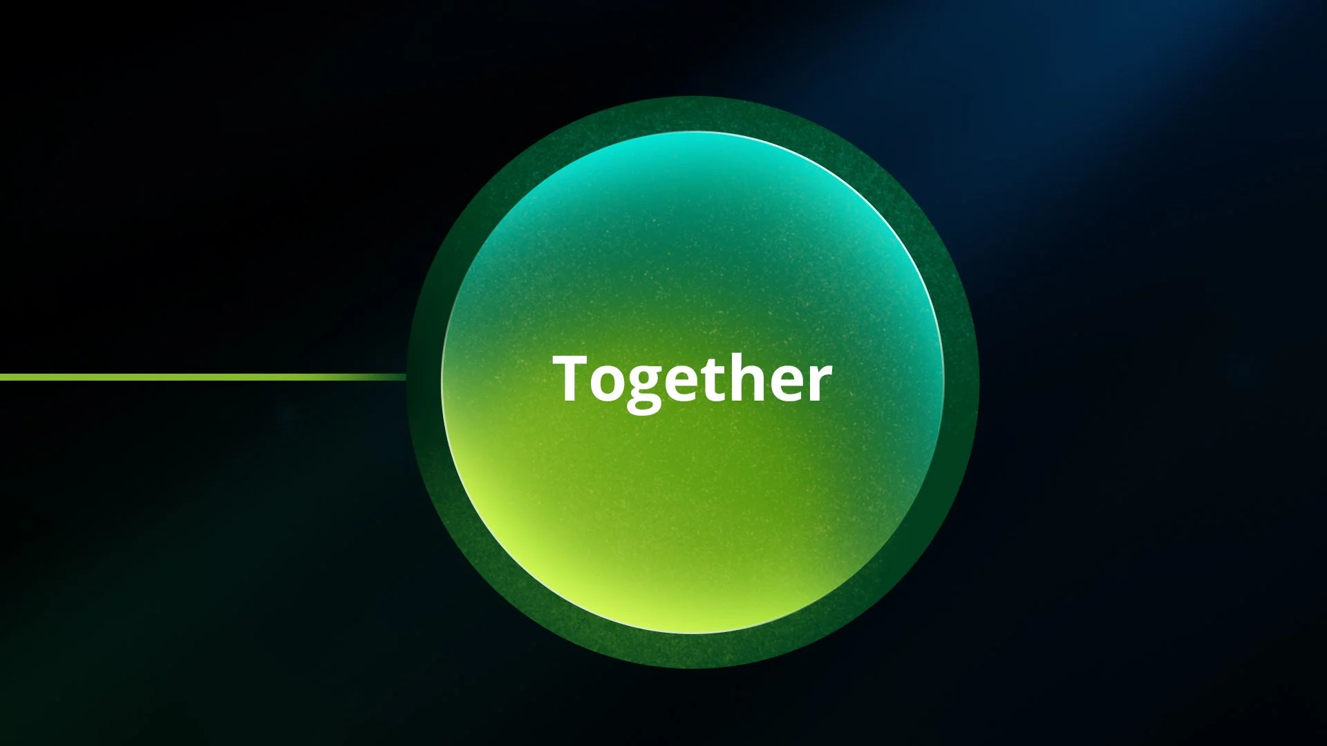
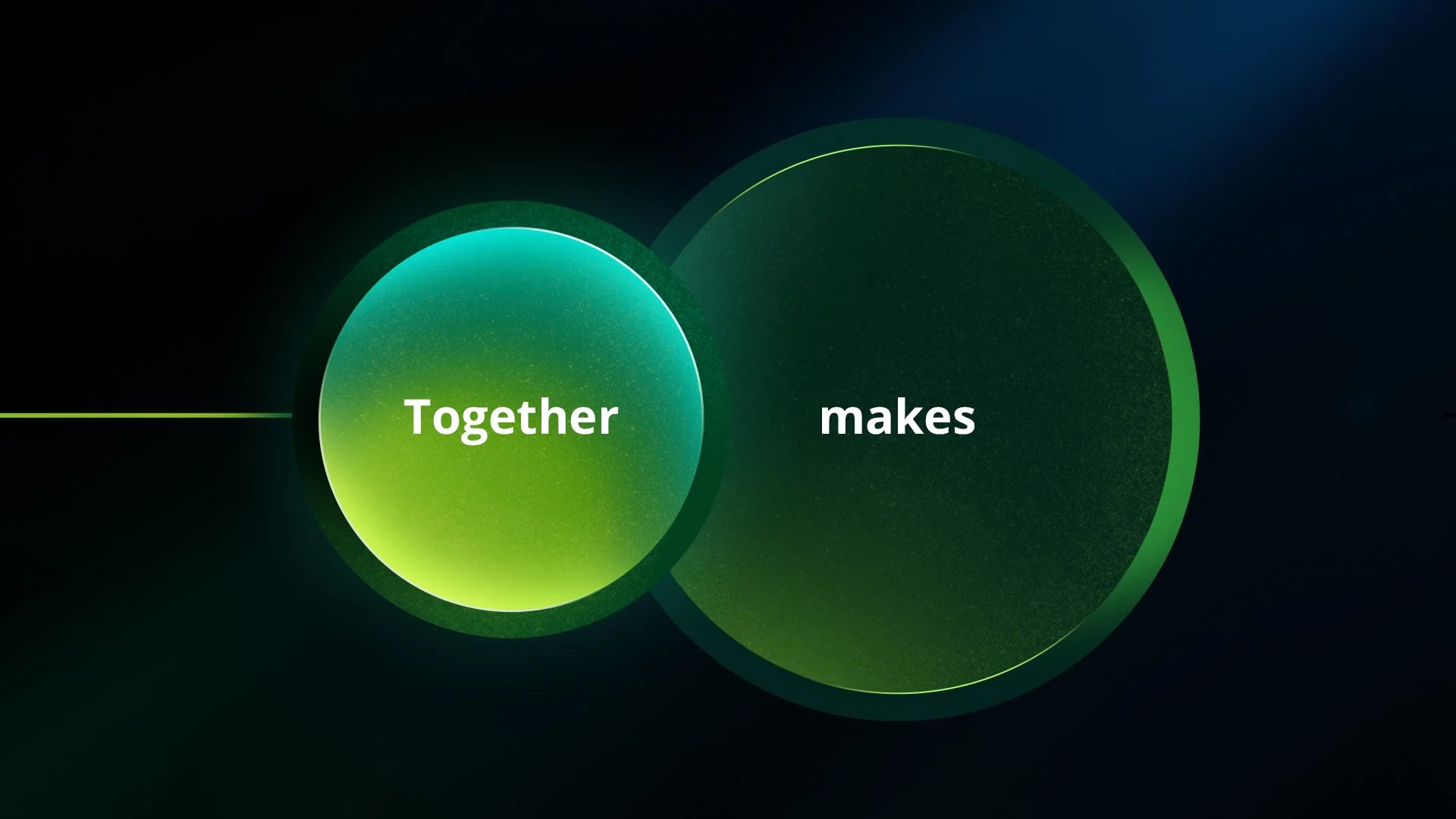
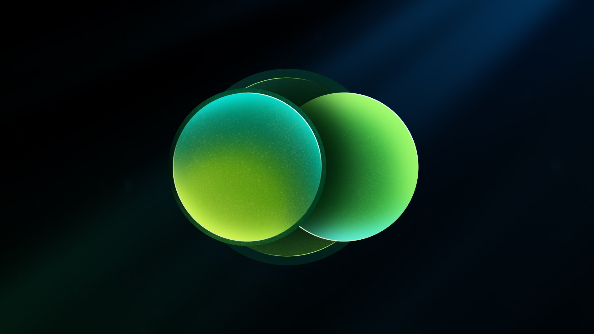


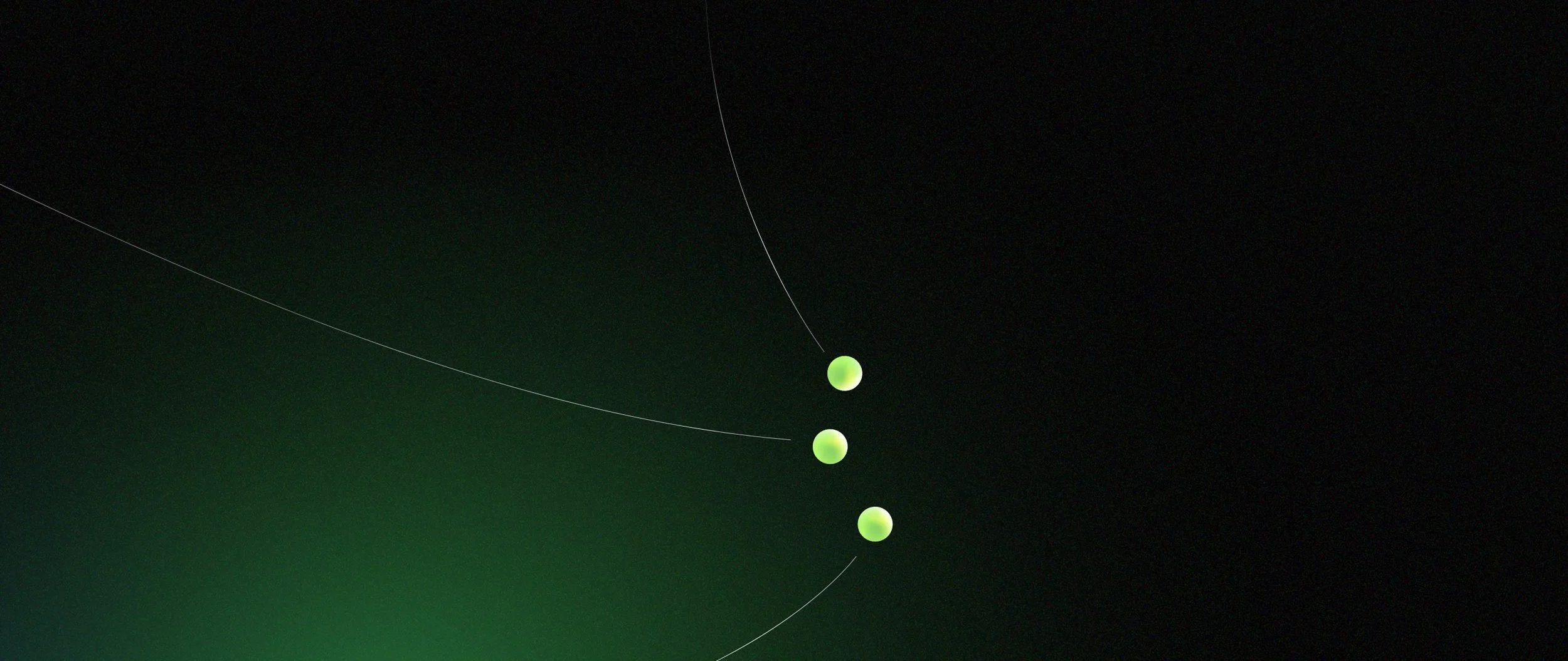
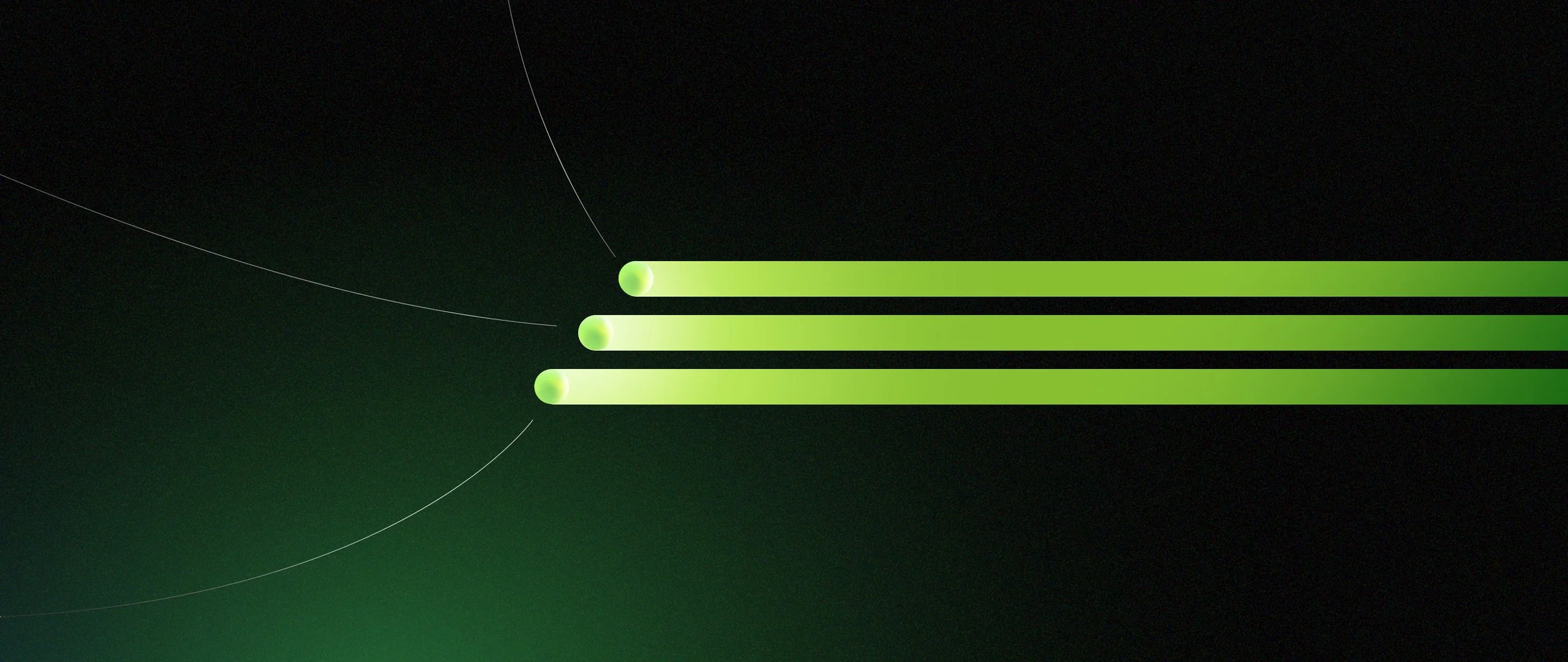
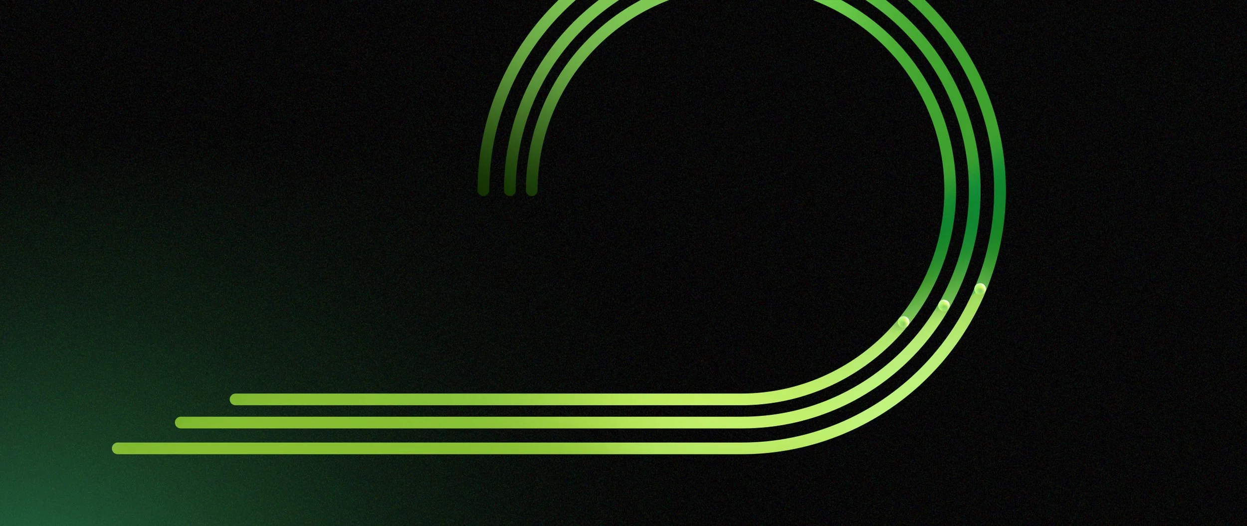
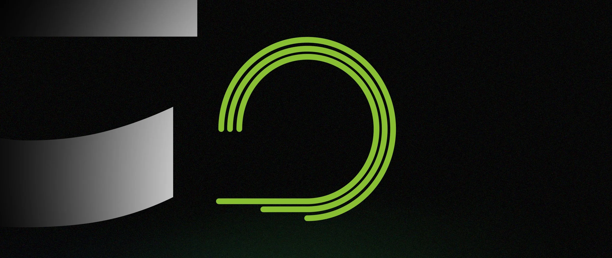
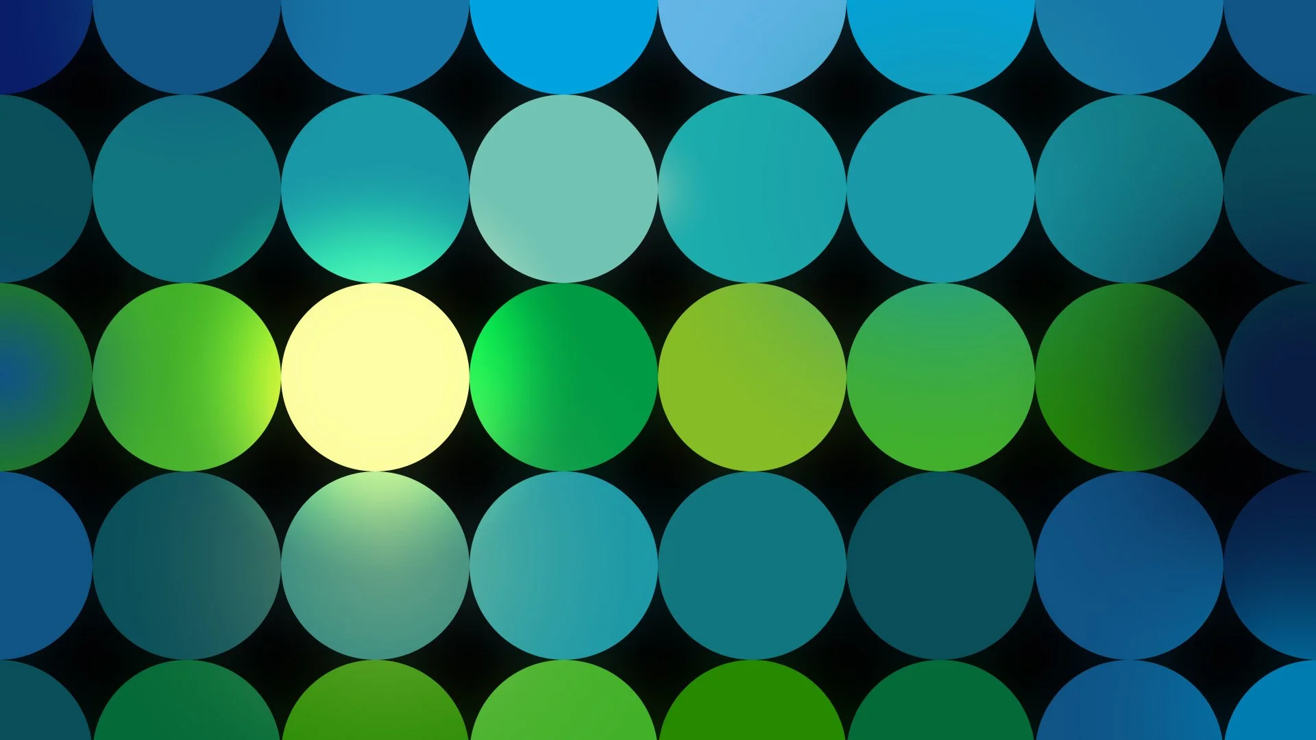
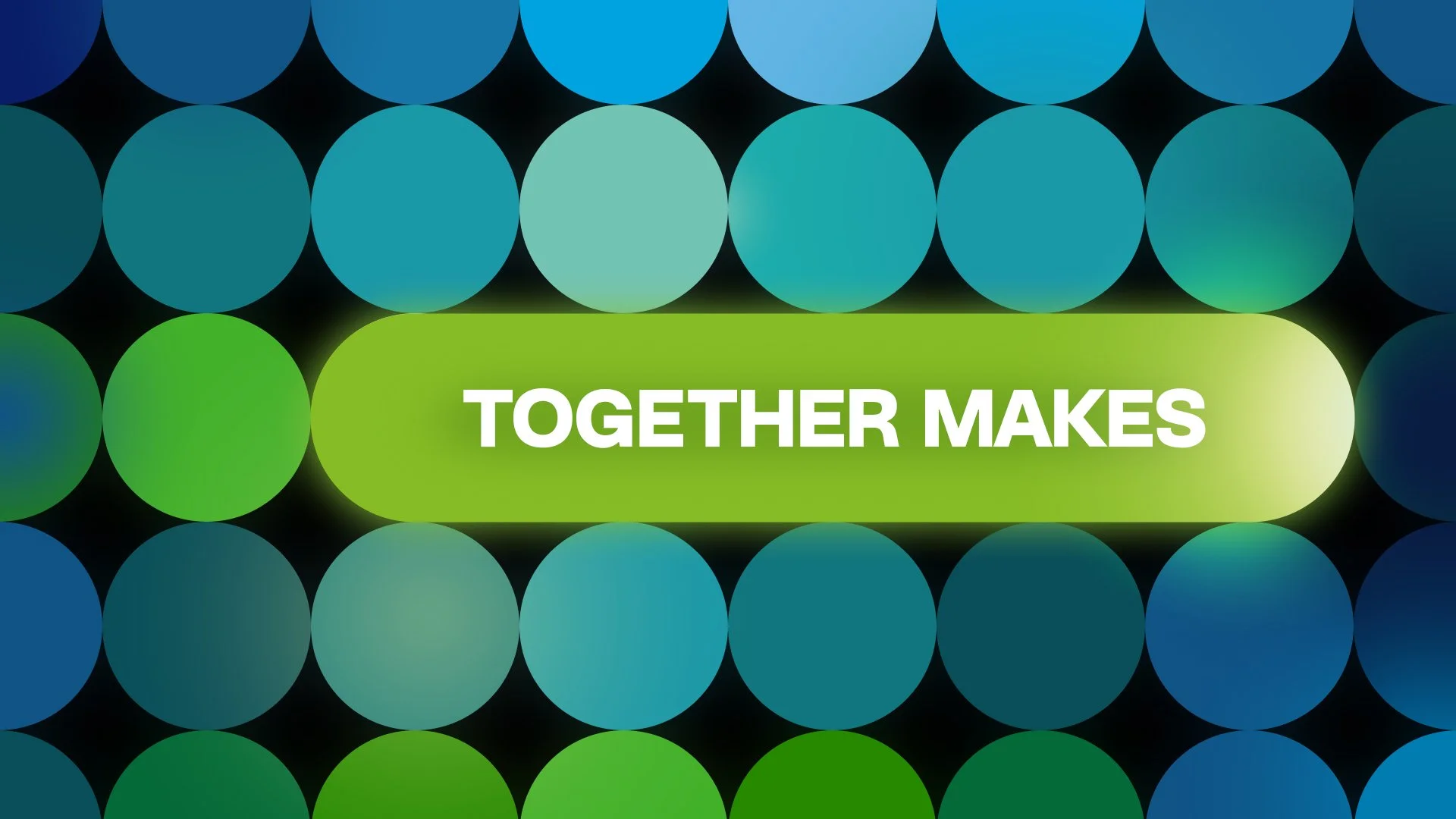
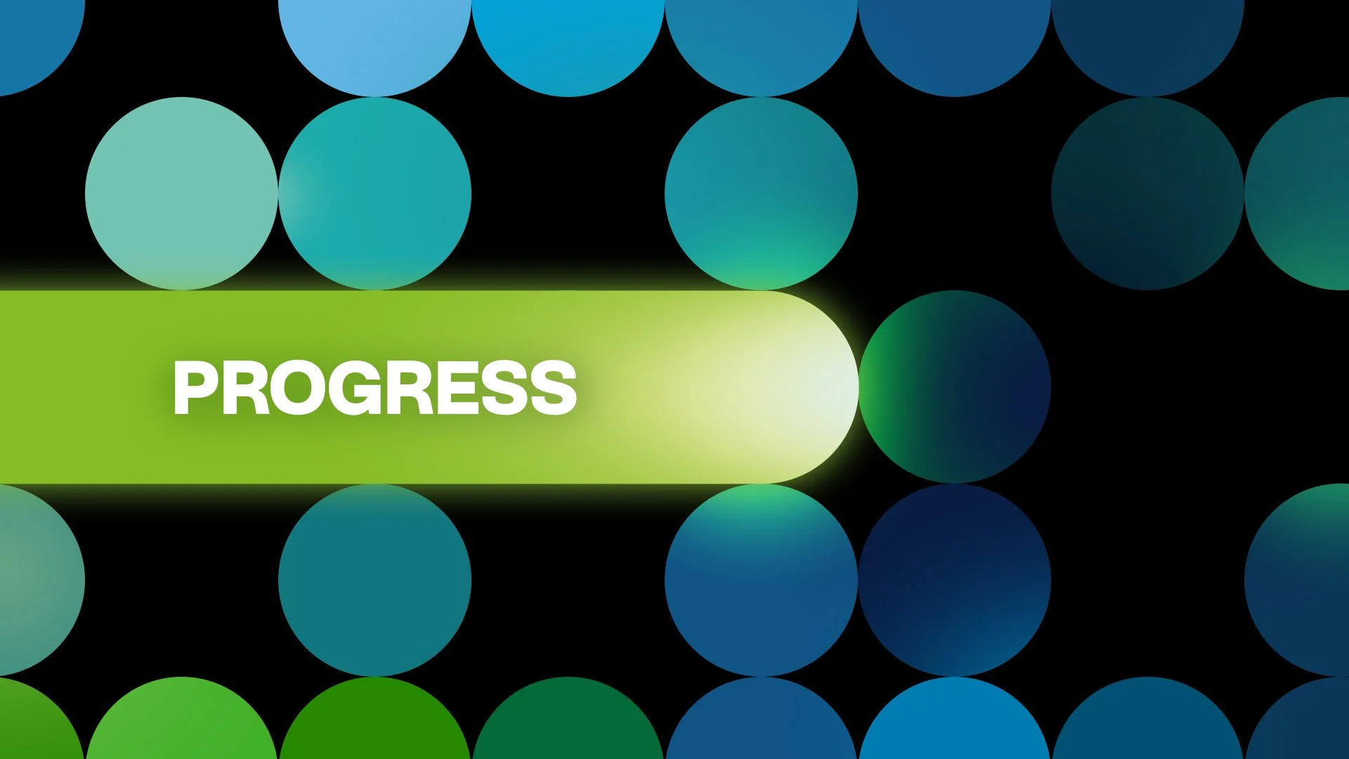
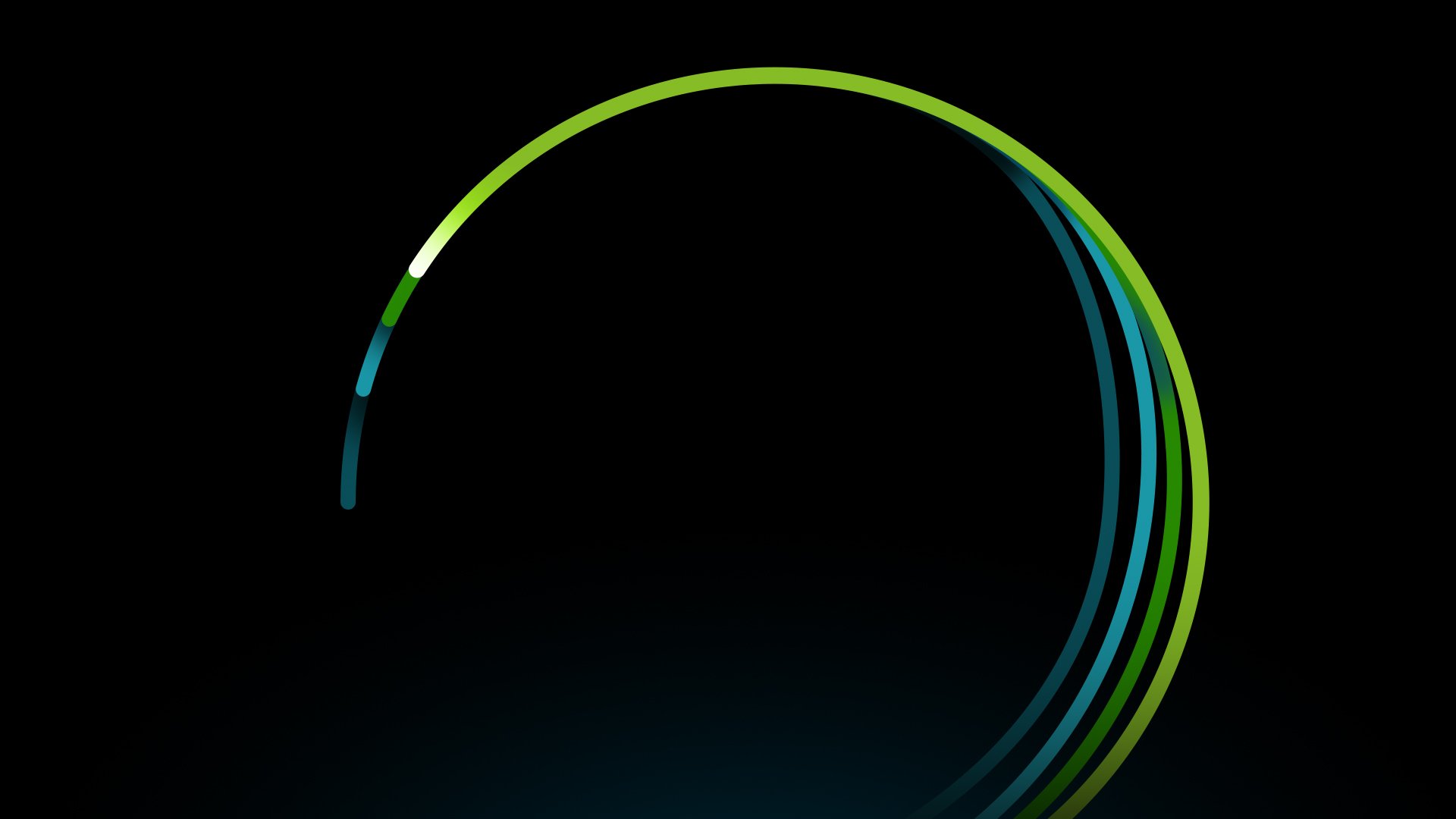
For this execution, the design approach leans more heavily into scale, rhythm, and repetition to visually express collective impact. A system of circular forms is used to represent individual contributions, which multiply and organize into larger patterns as the narrative builds. The density and repetition of these elements reinforce the idea that progress is not driven by a single force, but by many parts moving together.
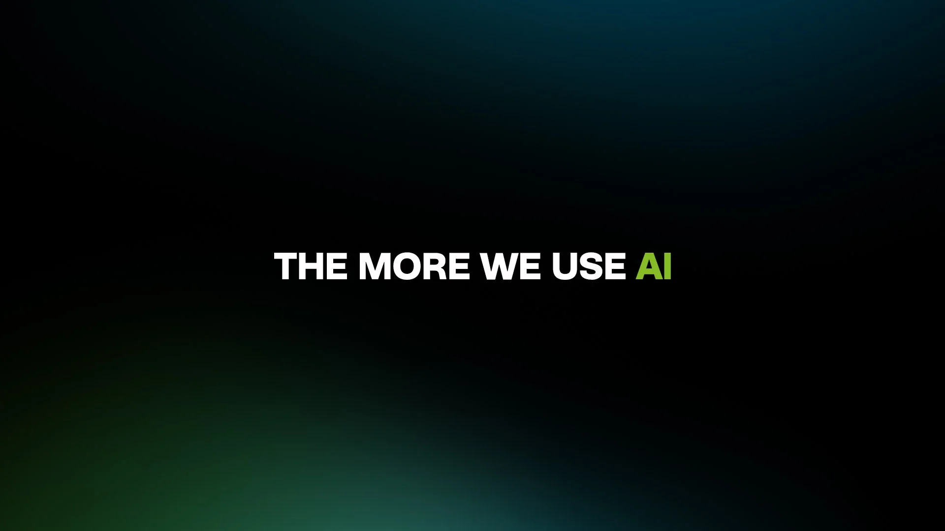
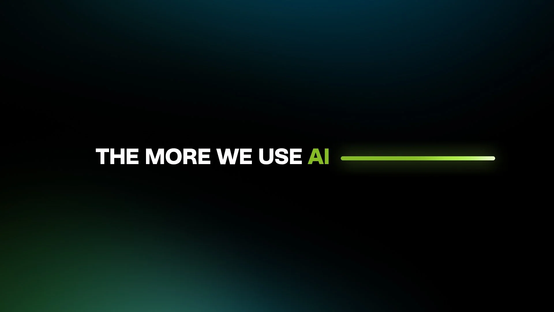
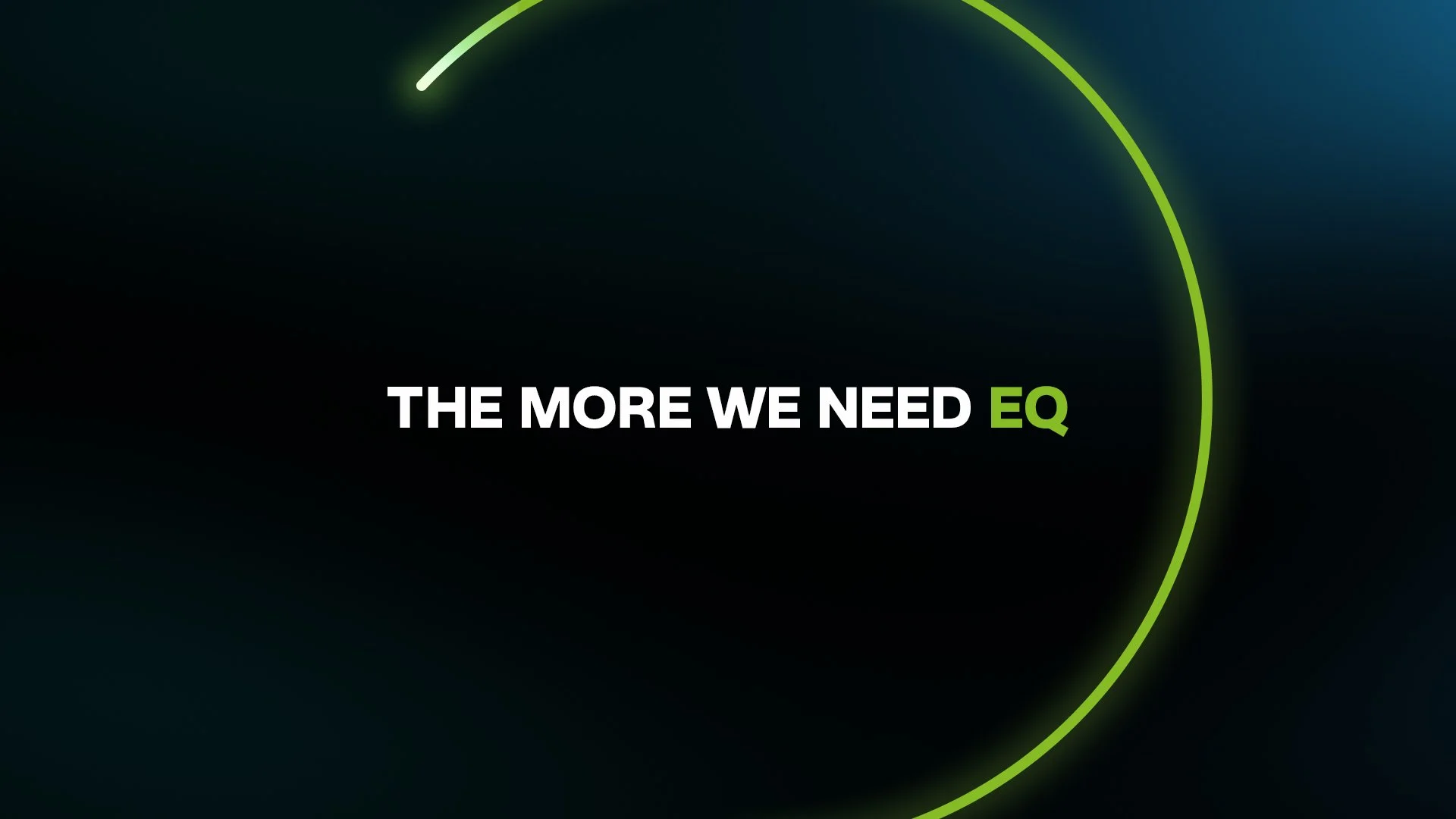
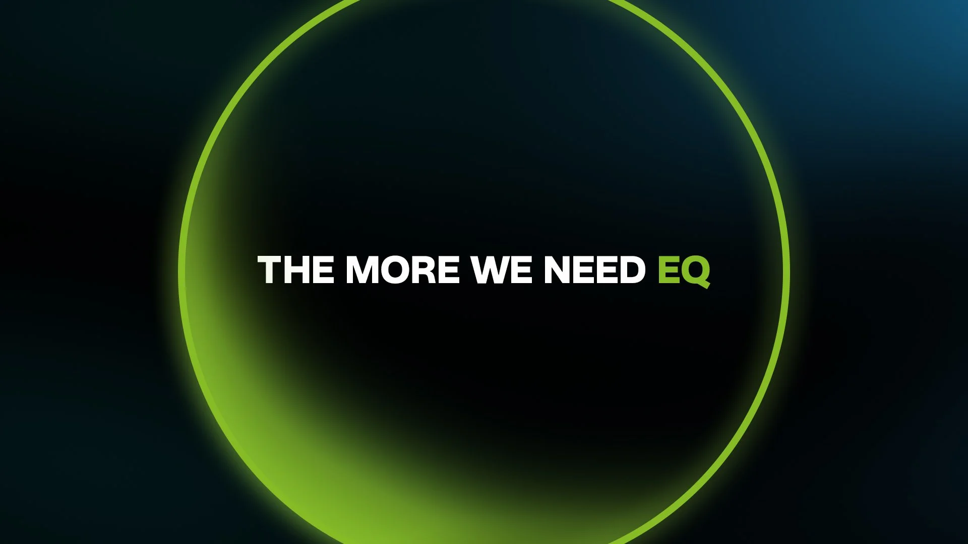
Motion is treated as a guiding thread throughout the piece, with lines and arcs leading the viewer’s eye across scenes and connecting ideas from AI to EQ. The use of bold, high-contrast typographic moments anchors the message within the complexity of the visuals, ensuring clarity at key beats. A cohesive palette of blues and greens with vibrant highlights maintains energy while staying distinctly within Deloitte’s brand. Overall, the system is designed to feel dynamic yet controlled, showing how structure, collaboration, and momentum come together to drive meaningful progress.
Design Sequence 2


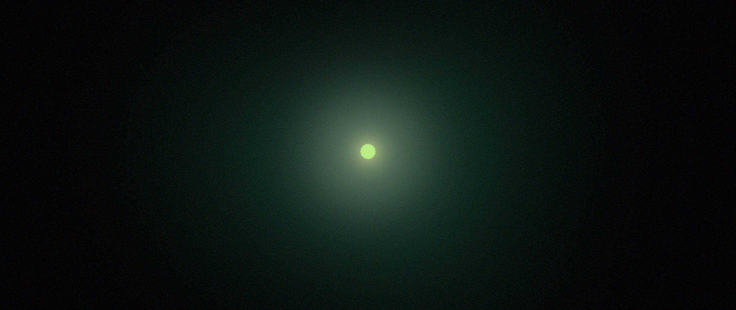
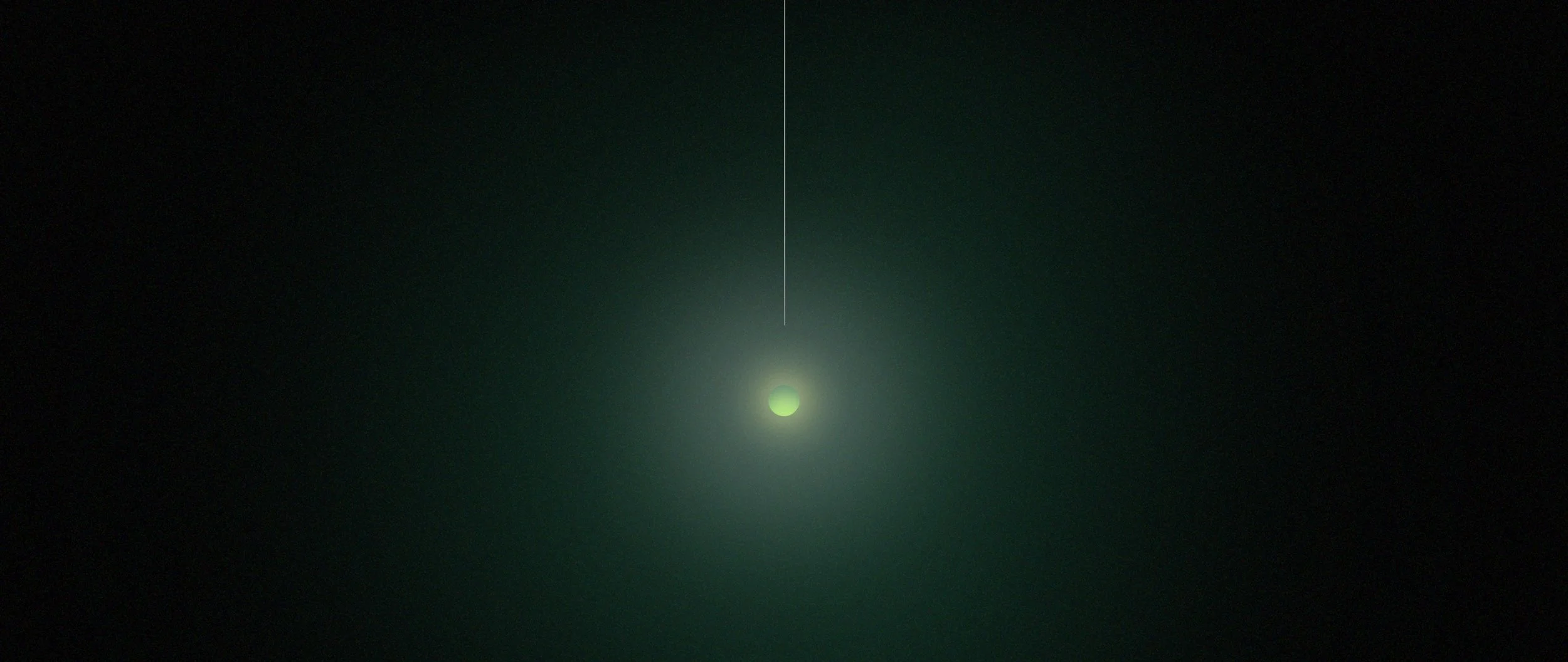
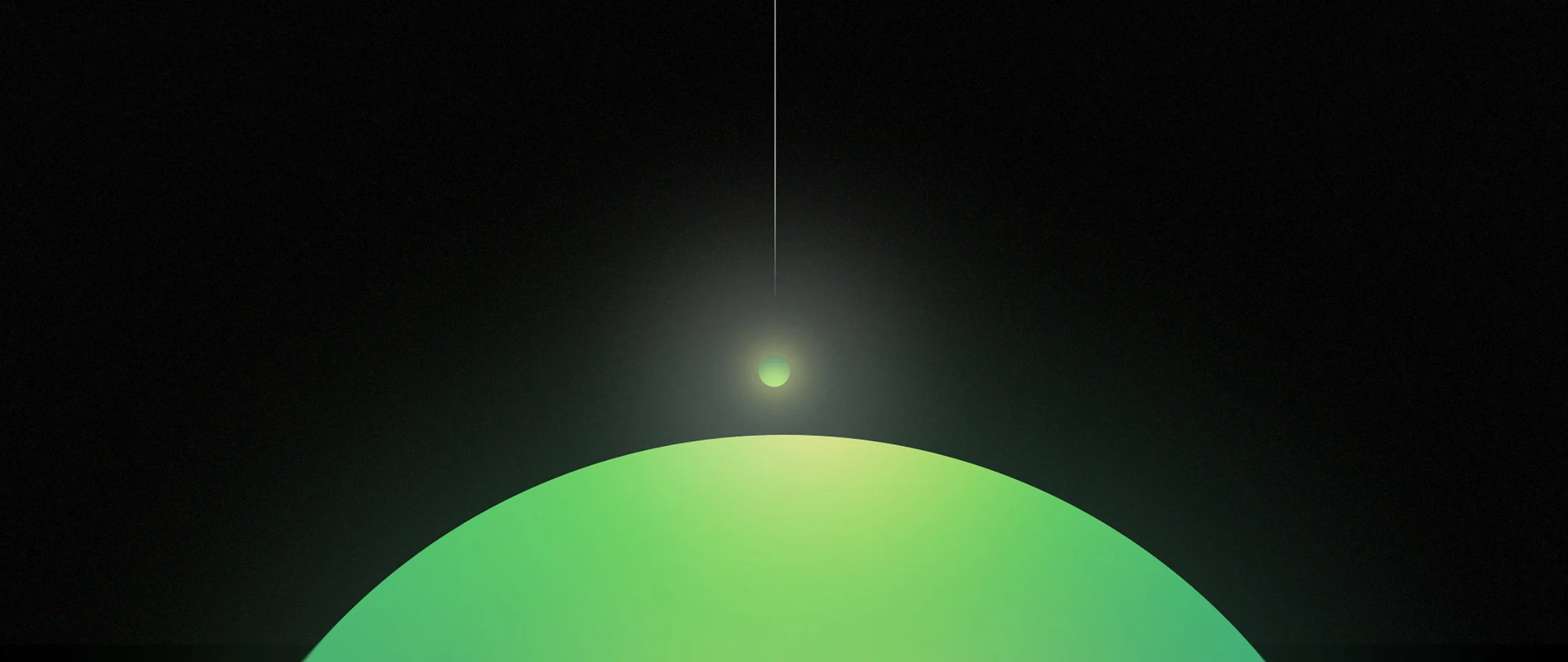
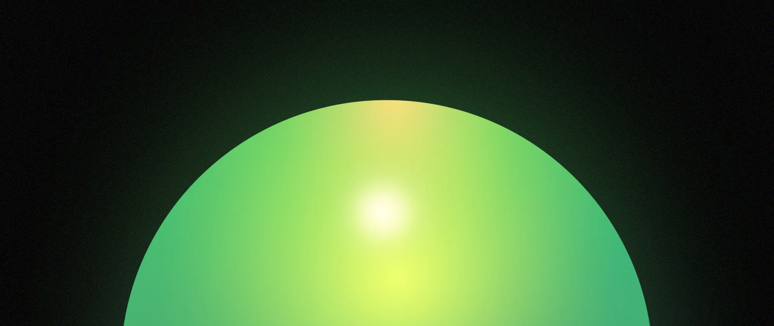
Design Sequence 3
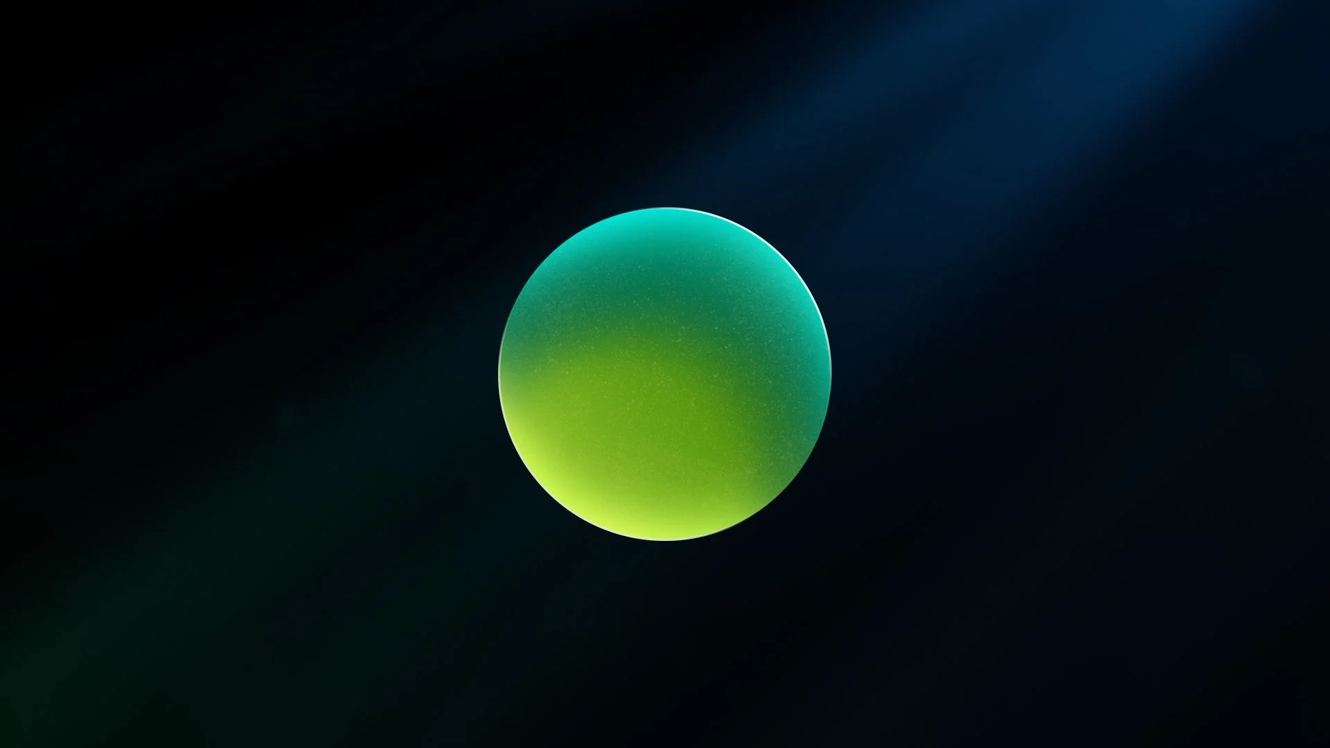
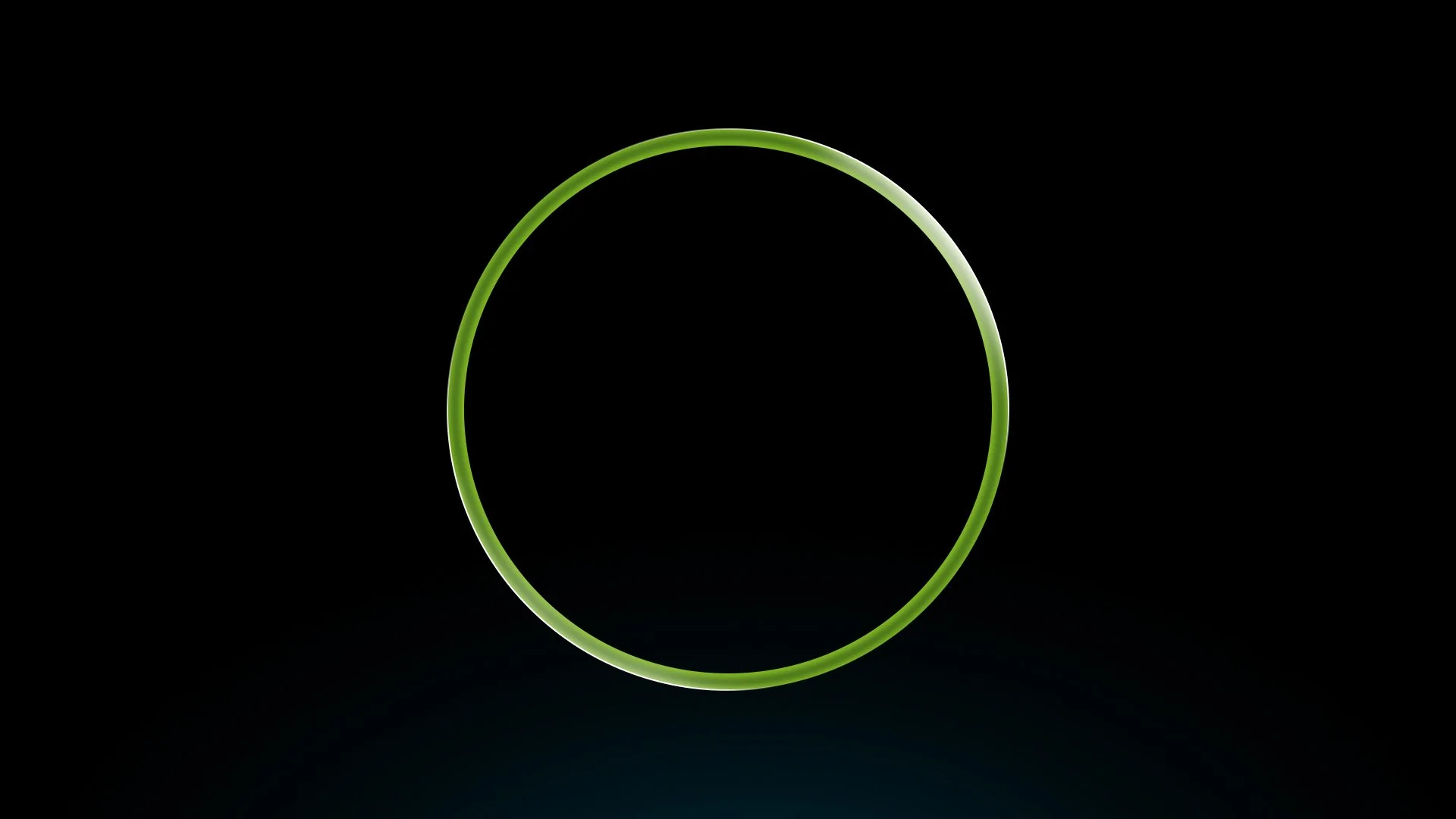
For this wide-screen execution, the design approach focuses on using depth and scale to guide the viewer through the narrative. A single sphere becomes the visual anchor, moving through layered space and pulling the audience from one moment to the next. By treating the sphere as a point of focus, the piece creates a sense of exploration and progression, as if the viewer is traveling through an evolving system.
Depth is reinforced through overlapping forms, soft glows, and subtle parallax, giving the visuals a dimensional, immersive quality. Lines, arcs, and orbiting elements echo the sphere’s movement, helping connect ideas across scenes while maintaining a steady visual rhythm. The restrained palette and minimal typography allow the motion and spatial relationships to do the storytelling, supporting Deloitte’s message that progress is achieved by navigating complexity with clarity, intention, and balance.