Emagality
Designer
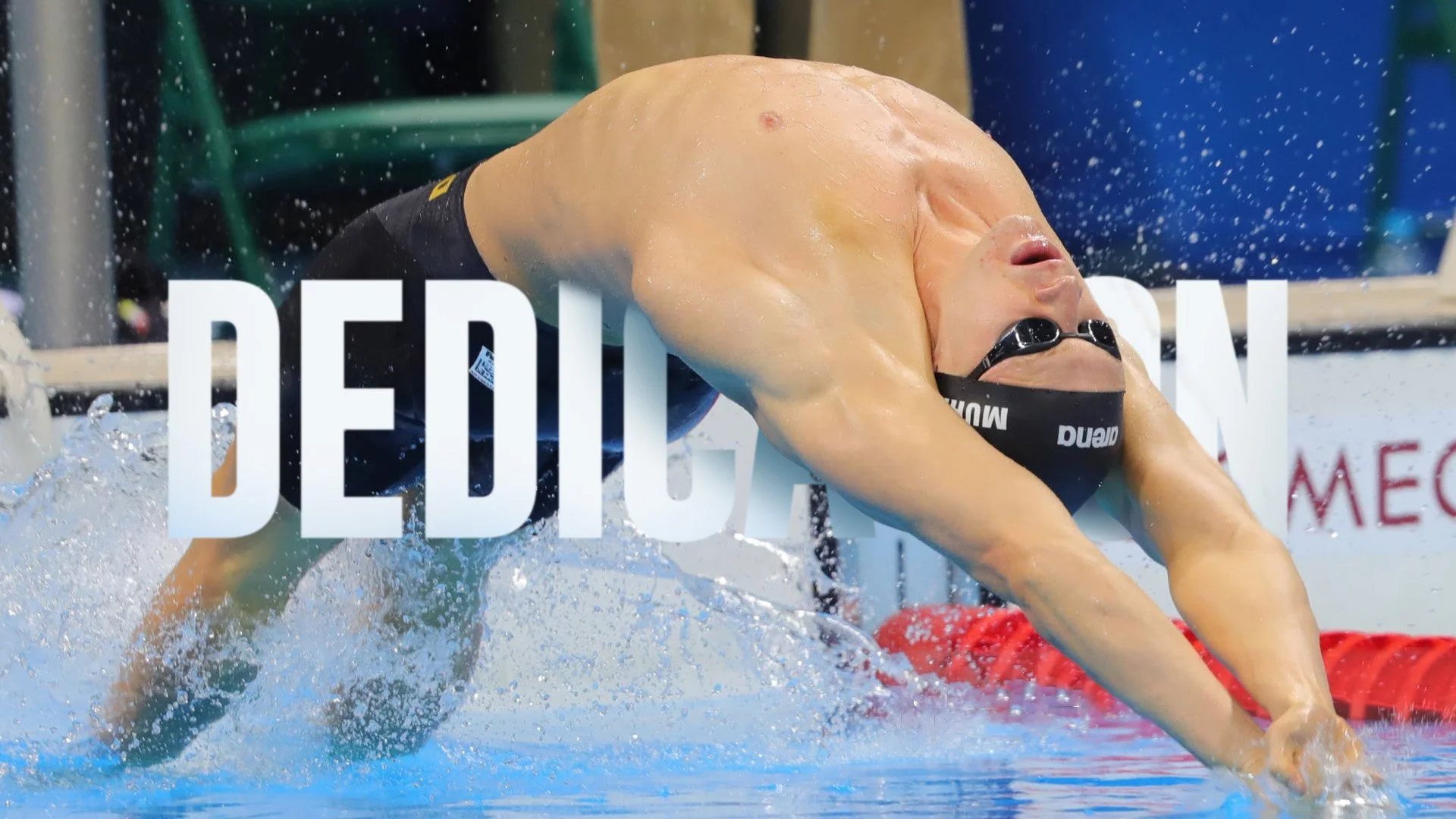
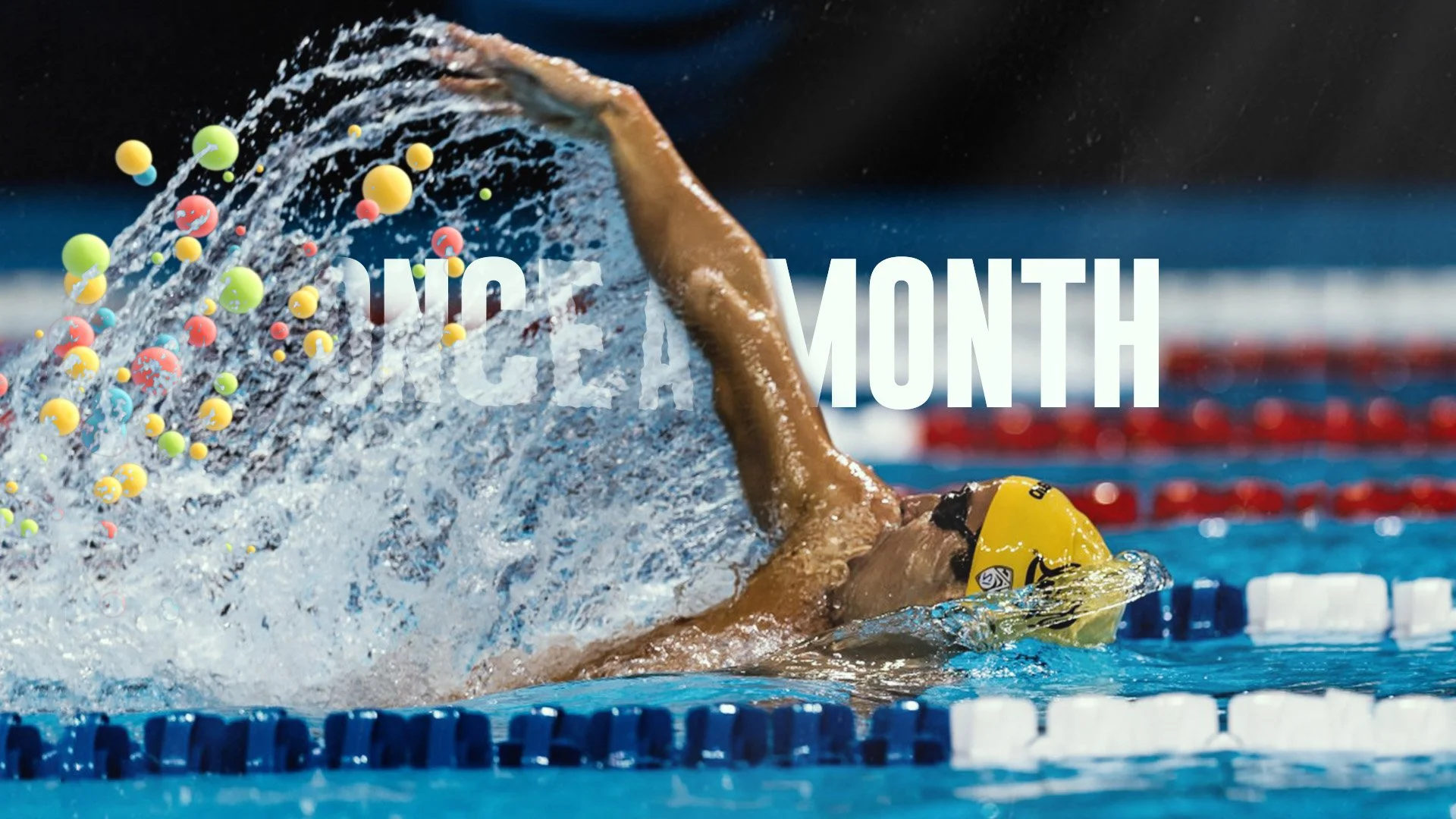
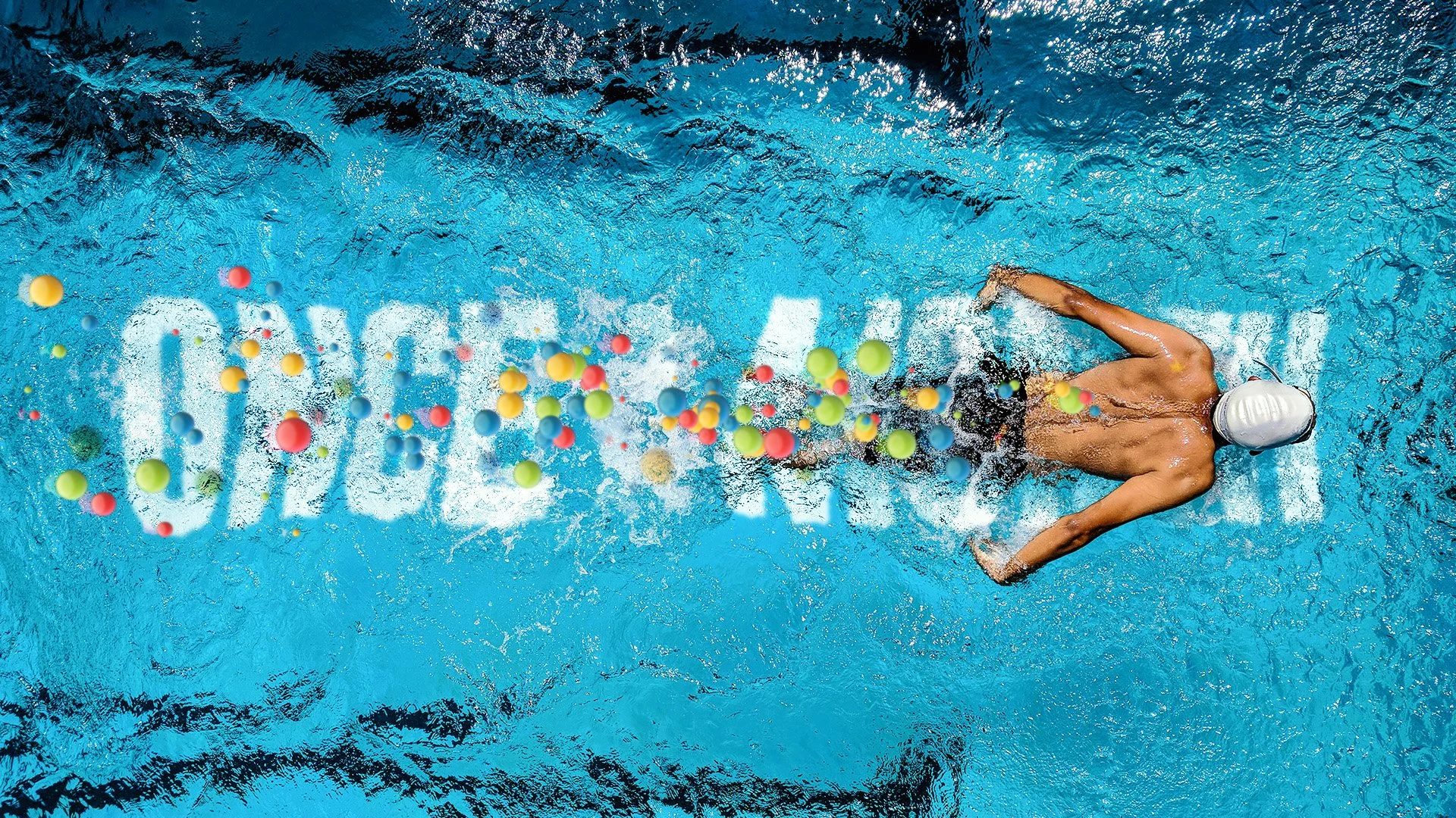
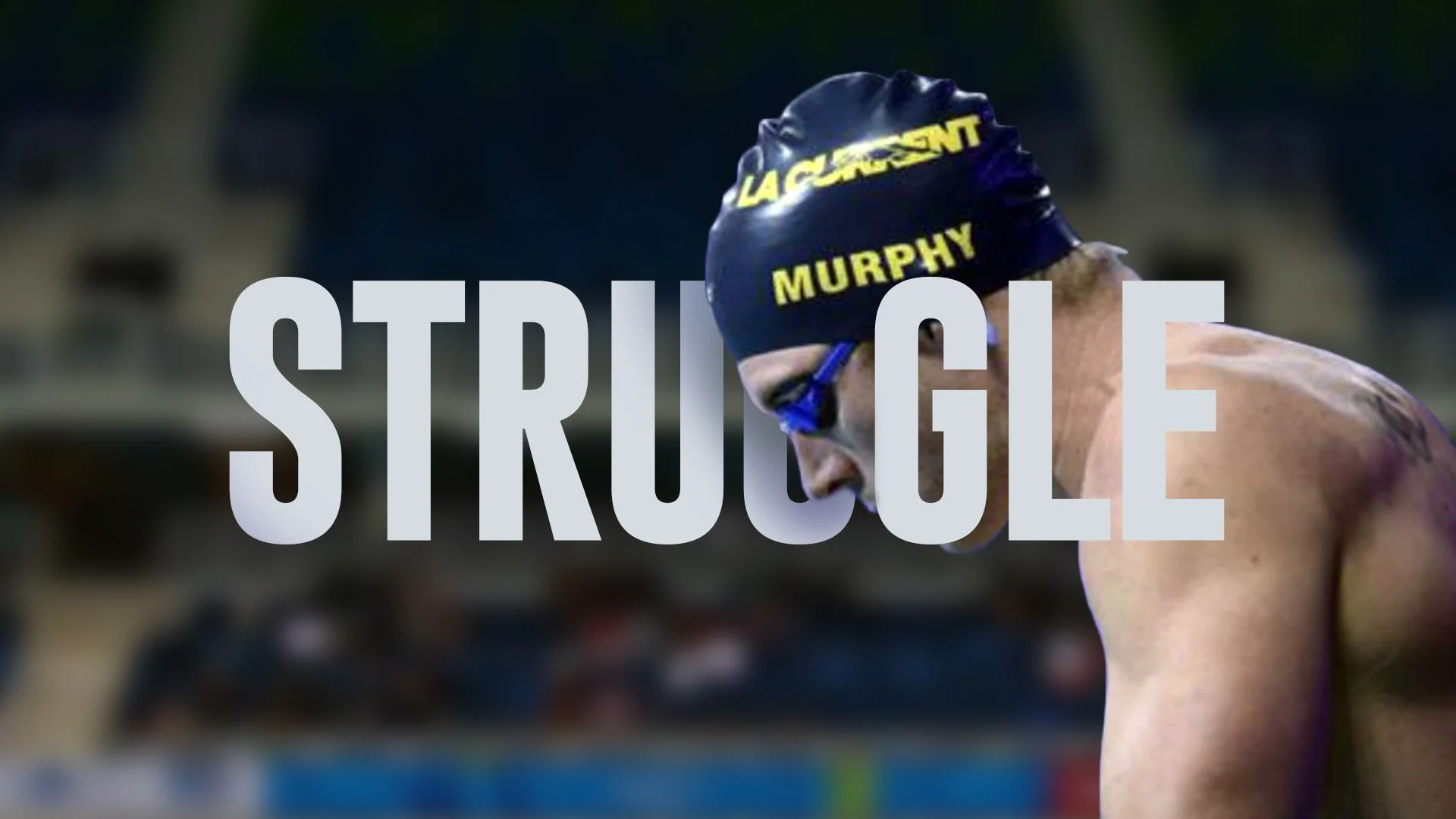
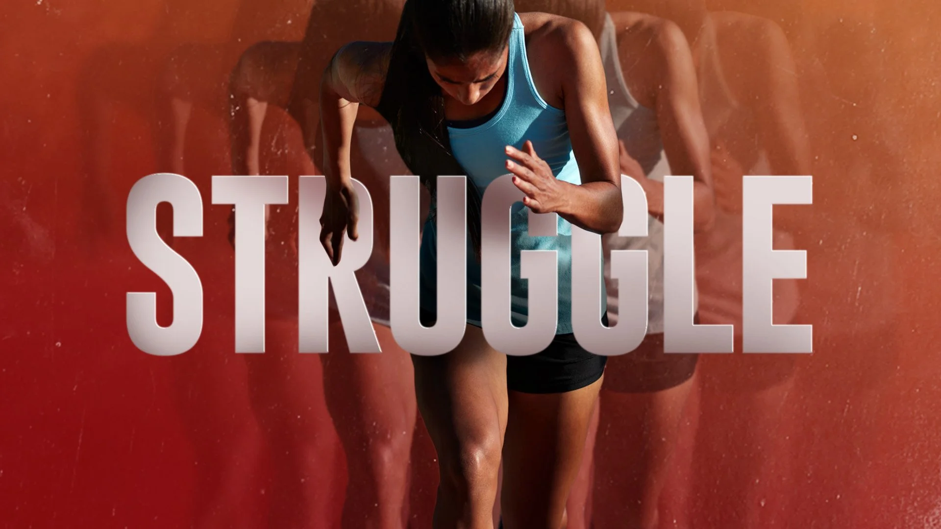
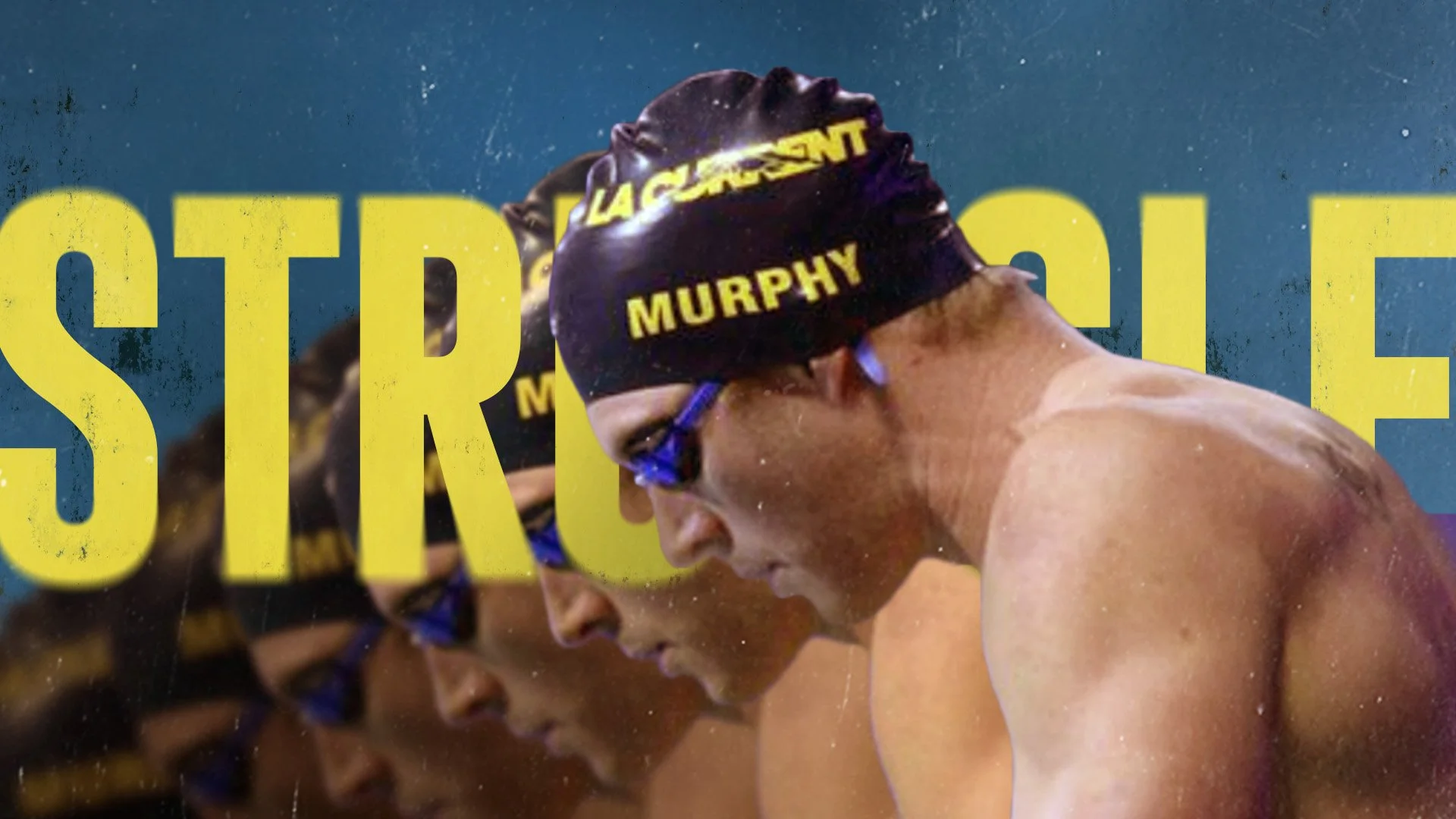
The type integration exploration for Emagality focused on treating typography as an active, expressive element rather than a static layer. Letterforms were designed to live within the motion, interacting with space, timing, and imagery to communicate Emagality’s core ideas of equity, inclusion, and shared humanity. The goal was to create typographic moments that felt human and intentional, allowing the message to unfold through movement, scale, and rhythm instead of relying solely on voice or copy.
Throughout the exploration, type was integrated directly into the visual system, responding to transitions, pacing, and composition in a way that felt cohesive and meaningful. Words shift, align, and connect with graphic elements to reinforce clarity and emotional impact, while maintaining accessibility and legibility. This approach allowed typography to carry both narrative and structure, supporting Emagality’s mission by making the message feel present, approachable, and deeply considered rather than decorative.