The main title design, illustration, and in-show graphics for John Lennon: Murder Without a Trial were developed as a unified visual system rooted in restraint, symbolism, and emotional weight. The goal was to support the gravity of the subject matter without sensationalizing it, using abstraction and reduction to create space for reflection. A limited palette and graphic simplicity allowed the visuals to feel investigative and somber, setting a tone that respects both the historical significance and the human impact of the story.
In addition to the main title, in-show graphics such as locations, lower thirds, and archival documents were designed to feel seamlessly integrated into the narrative. Typography and layout draw from period references while remaining clear and contemporary, ensuring readability without breaking immersion. Archival photography is treated with care through subtle framing, texture, and motion, reinforcing authenticity and continuity across the film. Together, the system creates a cohesive visual language that supports storytelling with clarity, sensitivity, and intention.
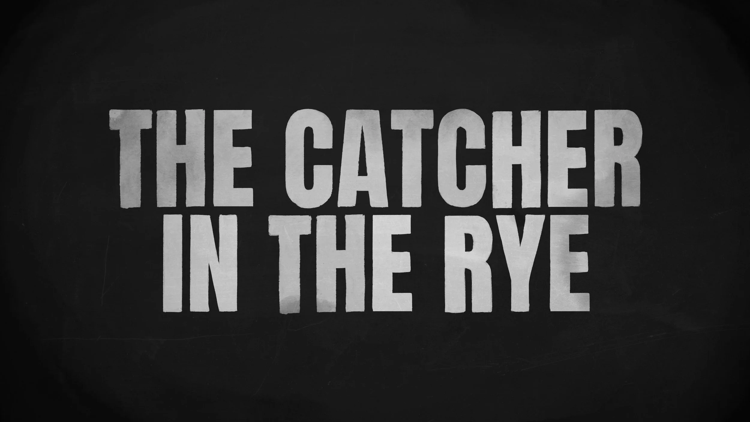
John Lennon: Murder without a Trial
Apple TV
Designer . Illustrator
Reel
Initial Design sequence
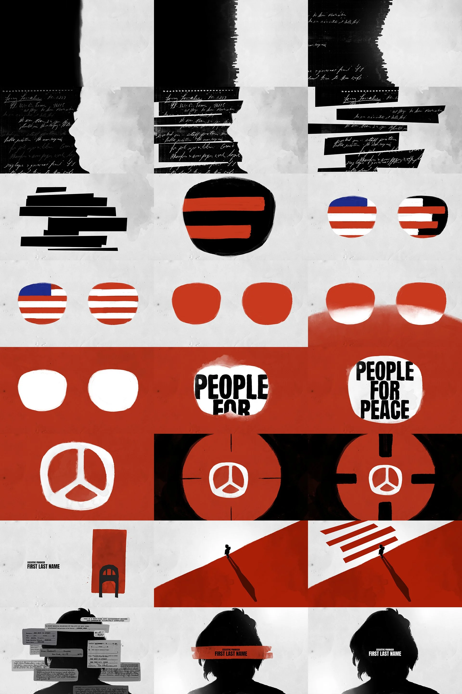
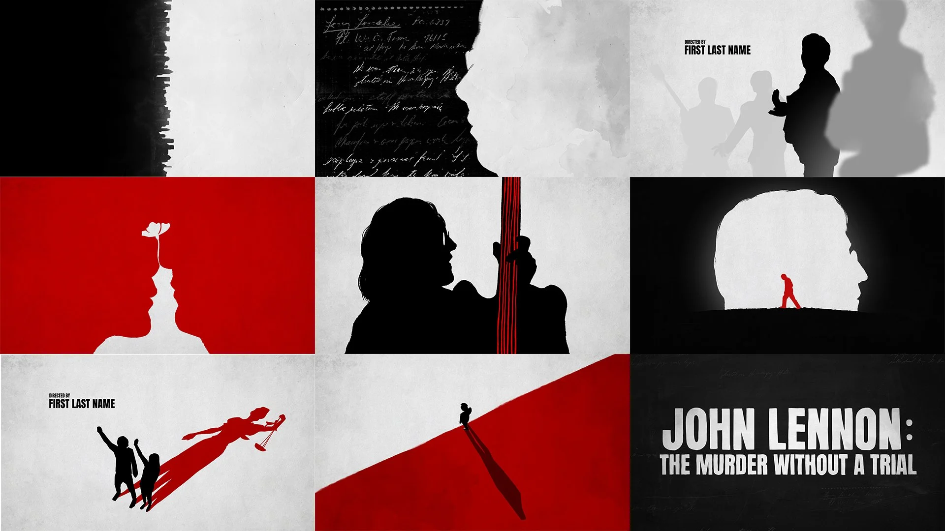
The opening design sequence establishes a restrained and unsettling visual language that reflects the gravity of the story. Abstract shapes, torn paper textures, and handwritten archival elements are introduced gradually, creating a sense of fragmentation and unease. The limited red, black, and off white palette is used with intention, allowing each frame to feel deliberate and emotionally weighted. Symbolic graphics such as the peace sign and simplified forms appear briefly and then dissolve, mirroring the way memory, truth, and narrative are constructed and deconstructed throughout the film. The sequence sets the tone before any dialogue is heard, grounding the audience in a quiet but powerful emotional space.
Final Design Sequence
After multiple rounds of revision, the final main title design sequence was refined and reduced to the frames shown below, distilling the visual language to its most essential elements while maintaining the emotional weight and narrative focus.
In-show graphics exploration
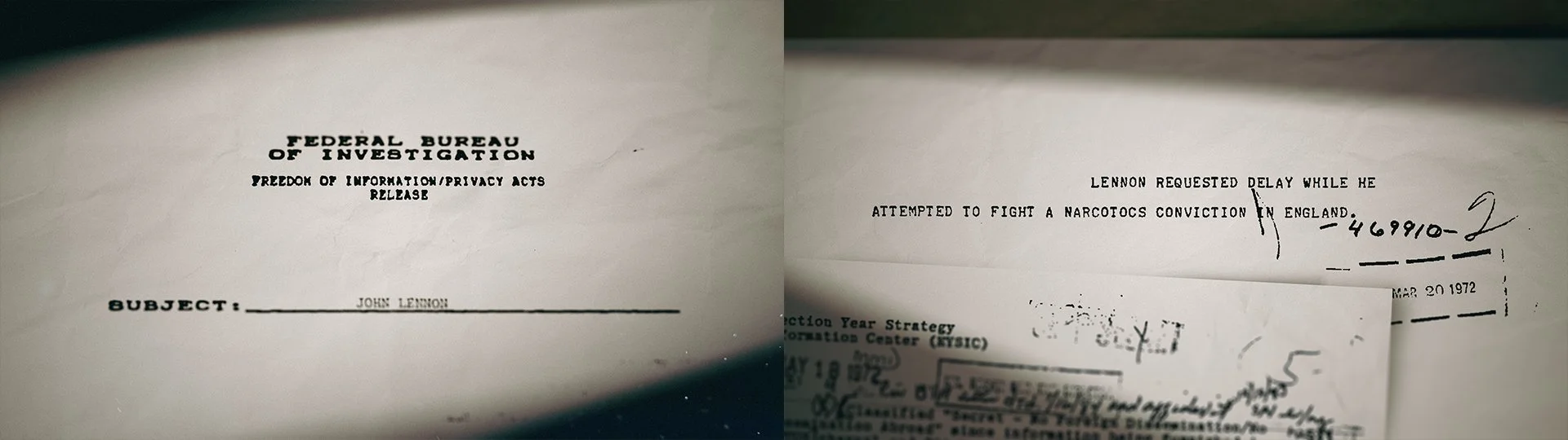
In addition to designing the main title for the documentary, we also explored a wide range of in-show graphics that appear throughout the film. Because the case took place in the 1970s, it was important for the visual language to feel grounded in that time period. We drew inspiration from archival documents, news clippings, typewritten records, and analog textures of the era, ensuring the graphics felt authentic and historically accurate. This approach helped the in-show graphics seamlessly integrate with the archival footage and interviews, reinforcing the credibility of the story while maintaining a cohesive visual identity across the documentary.
Documents and transcript records
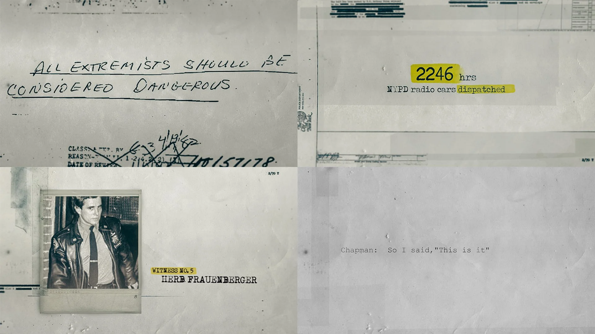
Type-driven moments
Documentary style photography treatments
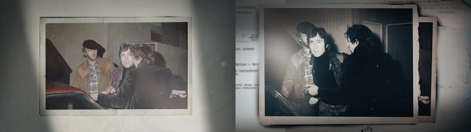
Cinematic emphasis on documents