Fanatics Sportsbook
Designer
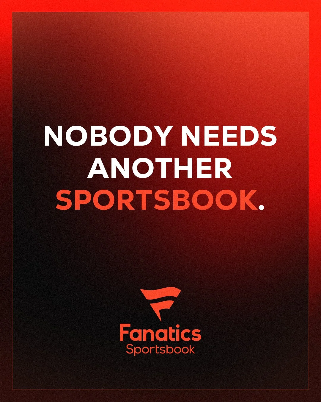
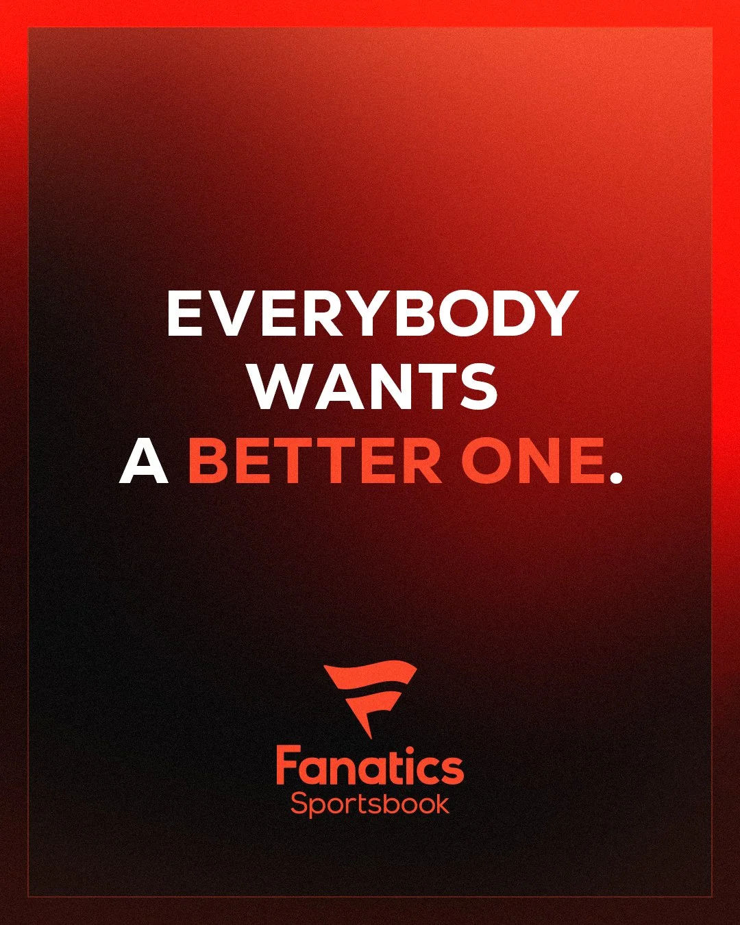
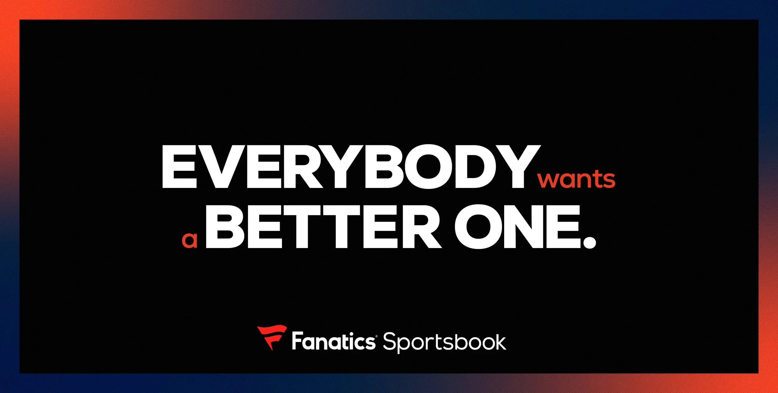
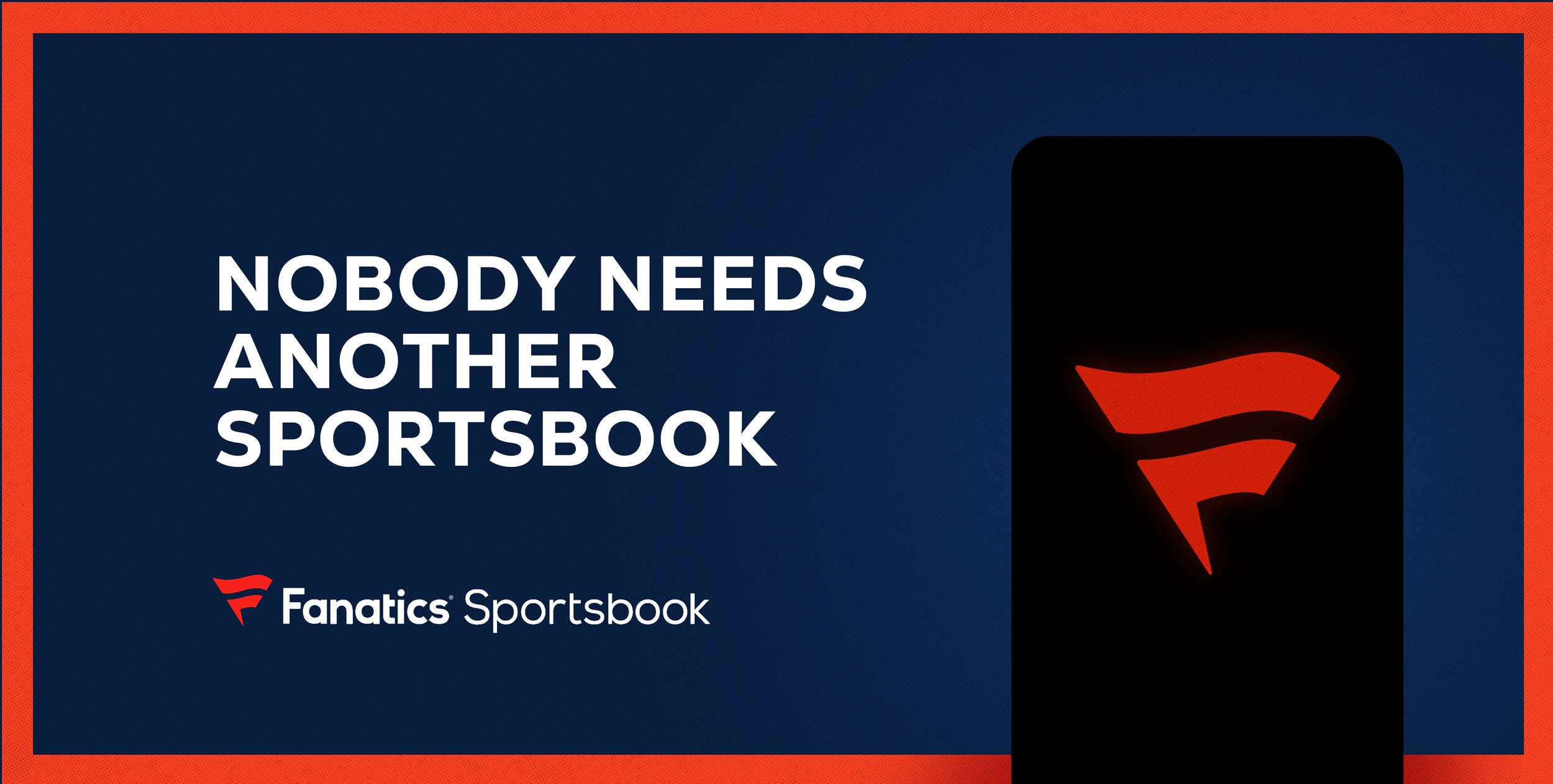
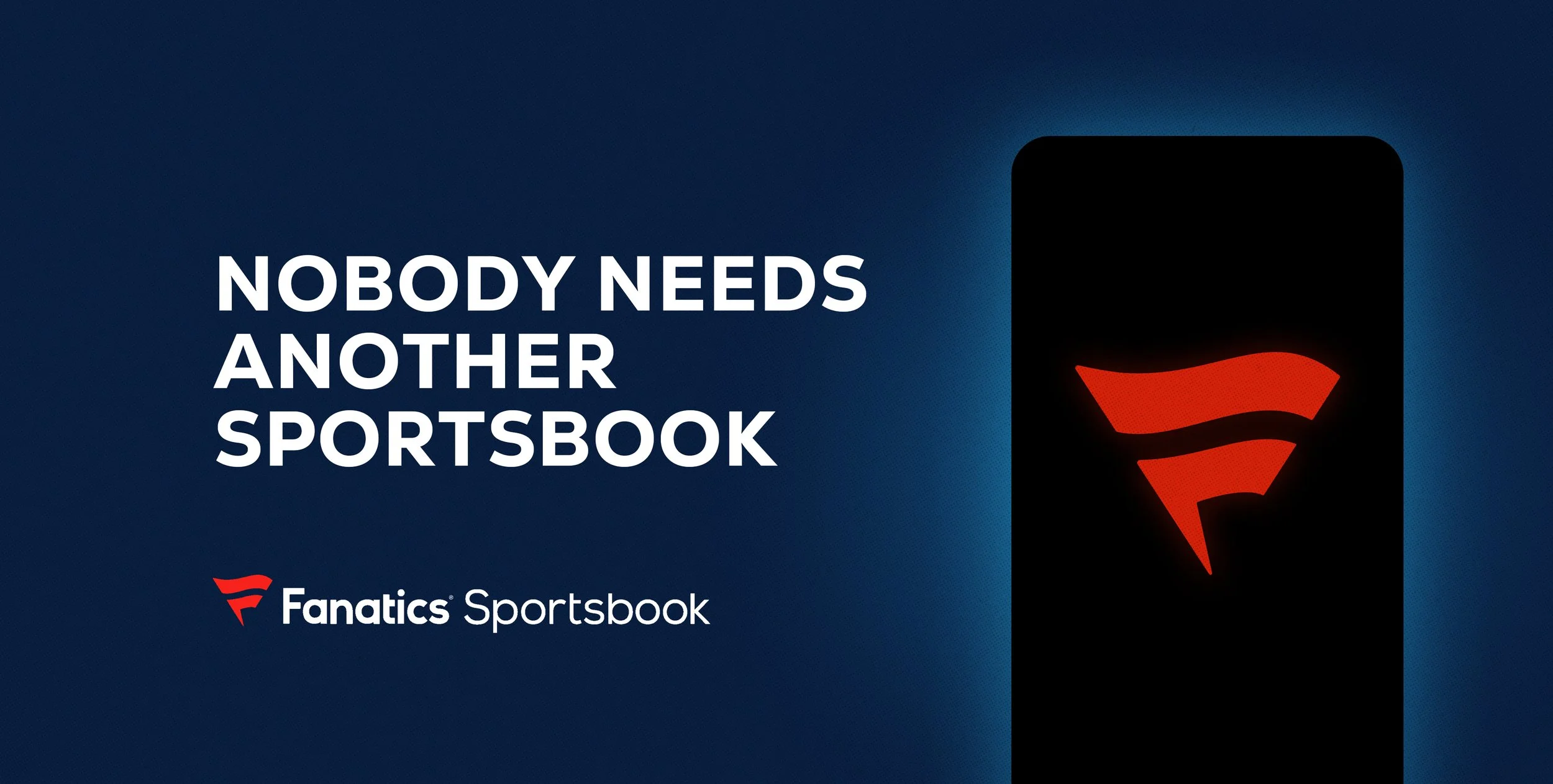
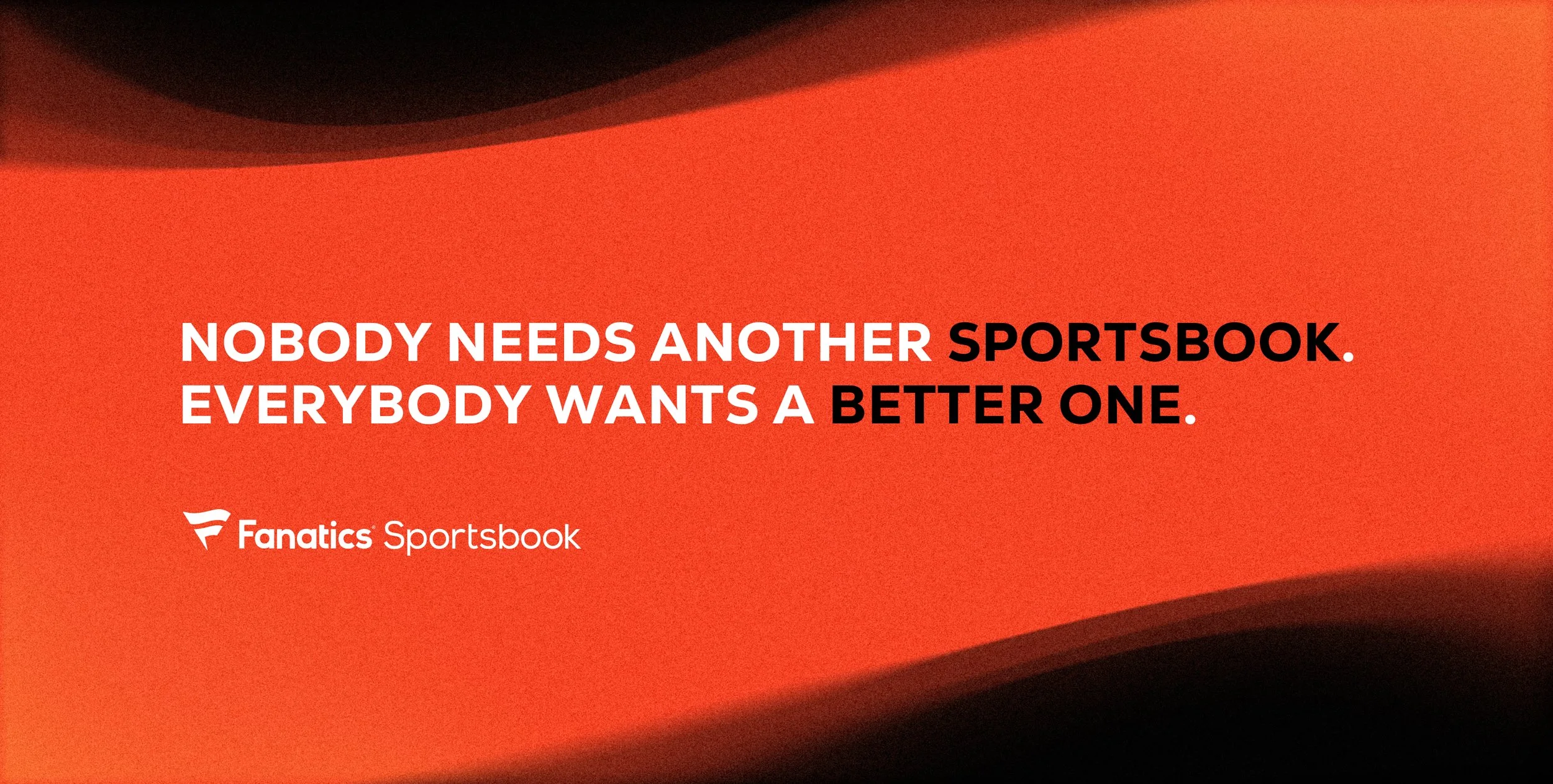
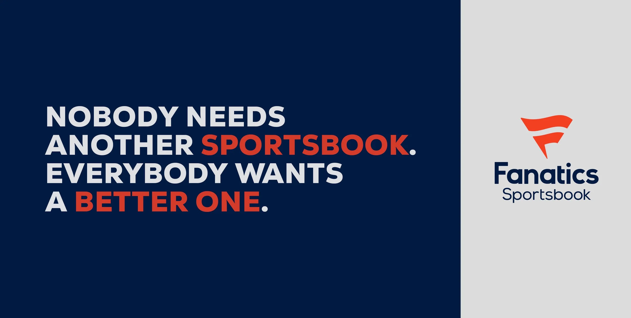
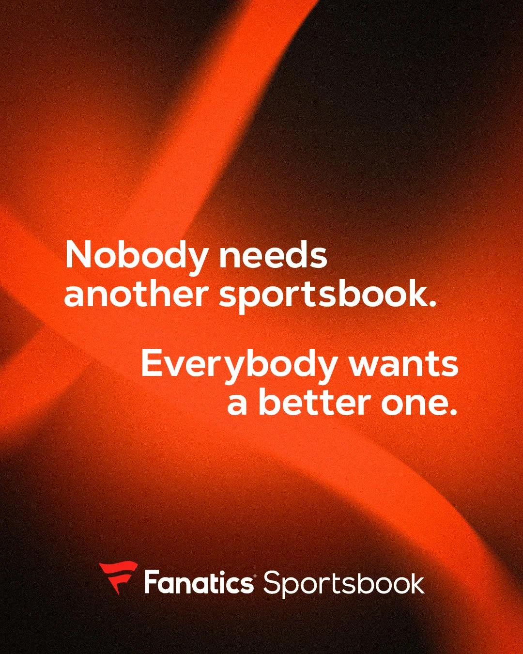
The creative approach centers on a bold, declarative message that immediately cuts through a crowded sportsbook landscape. Typography is treated as the hero, using confident scale, weight, and contrast to make the statement feel unapologetic and self-assured. The visual system balances intensity with clarity, reinforcing the brand’s promise of offering something fundamentally better rather than just louder.
A high-energy palette of deep blacks, rich blues, and vibrant reds anchors the work in Fanatics Sportsbook’s brand identity. Subtle gradients, soft motion, and layered depth add a sense of momentum and modernity, allowing the messaging to feel dynamic without distracting from its core idea. The result is a flexible system that feels premium, assertive, and built for performance across multiple touchpoints.
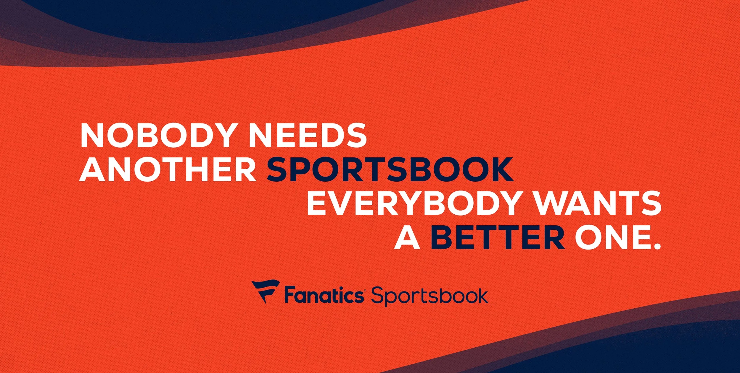
Billboard Design Exploration
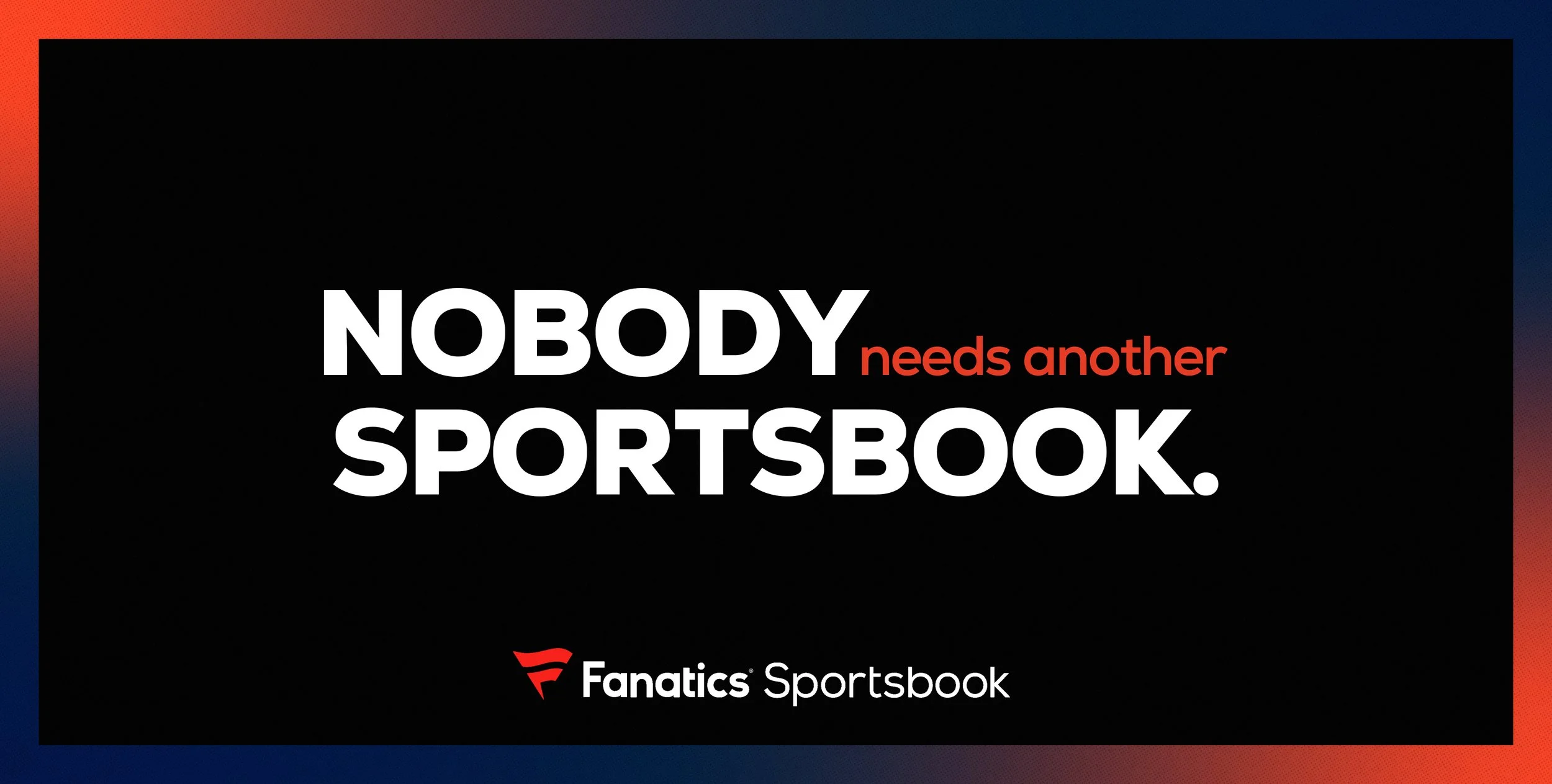
For billboard executions, the focus was on maximum legibility and impact at a distance. Short, punchy lines are set in bold typography with strong contrast against simplified backgrounds, ensuring the message reads instantly at high speed. Color blocking and minimal composition keep the layouts clean and confident, while subtle brand accents and gradients add depth without compromising clarity. Each billboard is designed to feel iconic, direct, and unmistakably Fanatics.
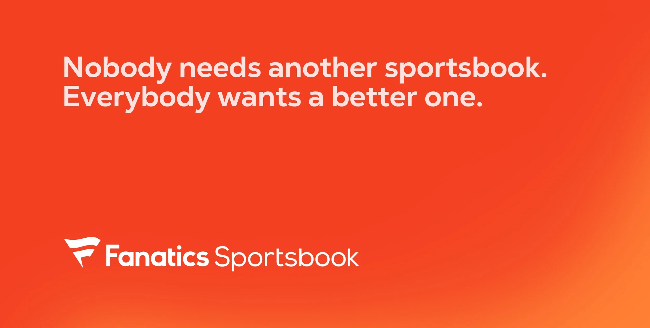
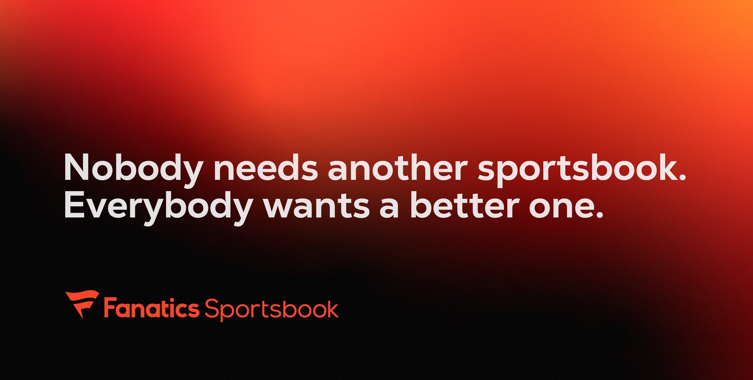
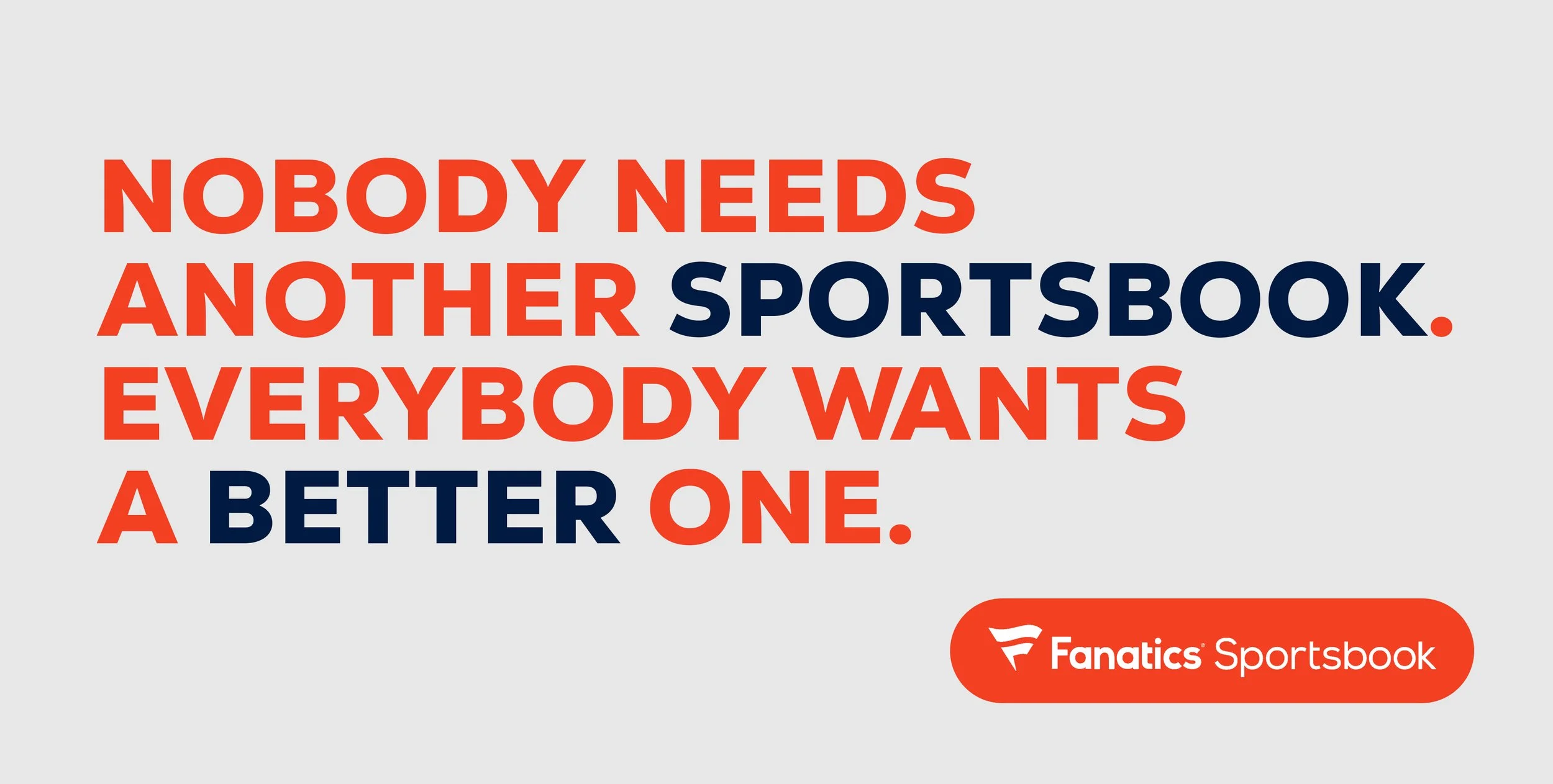
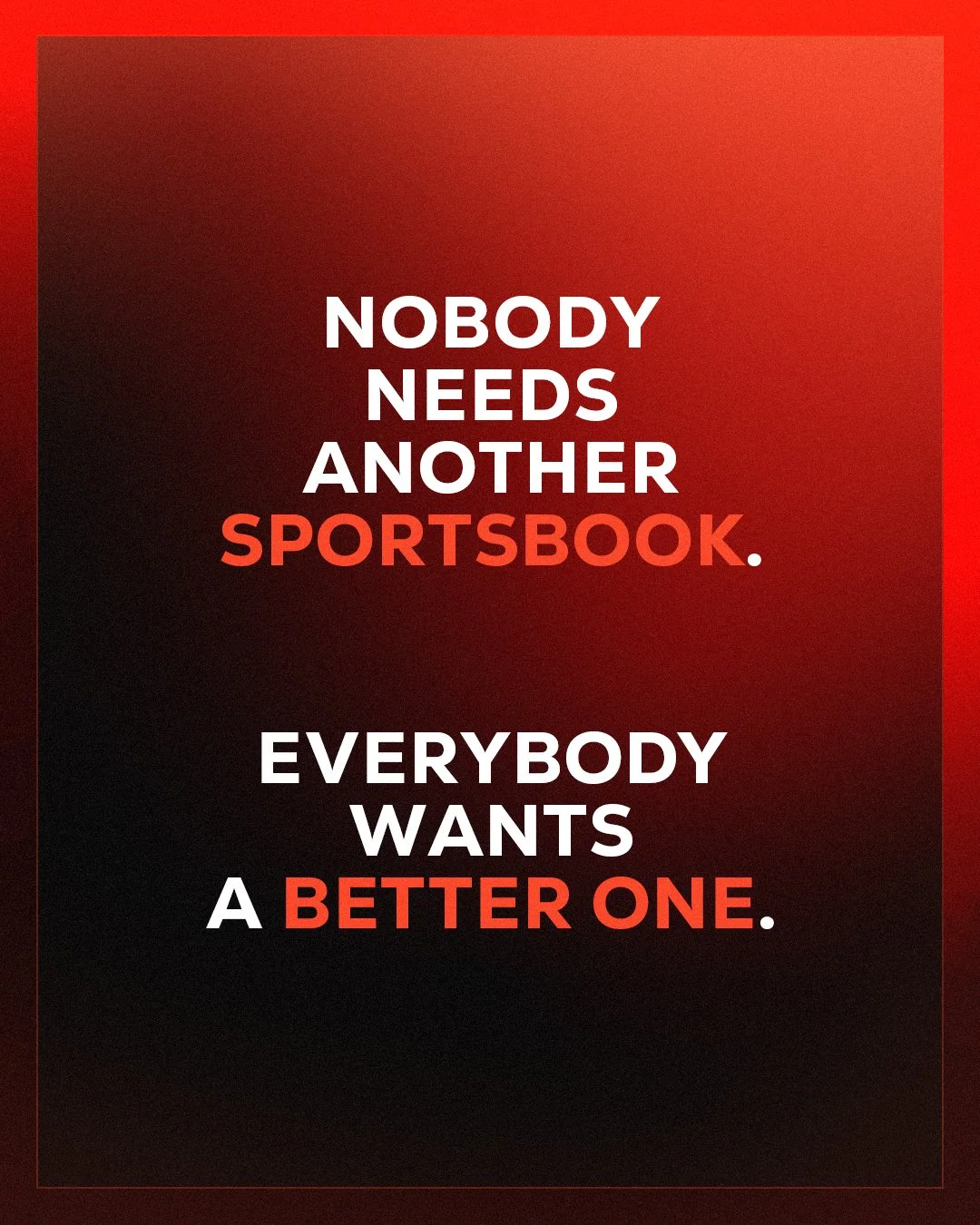
Social Design Exploration
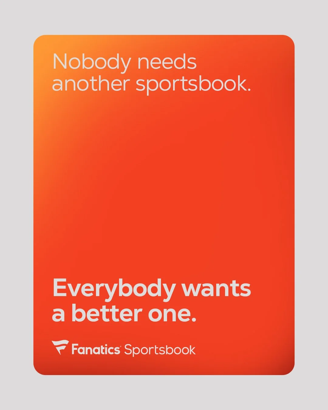
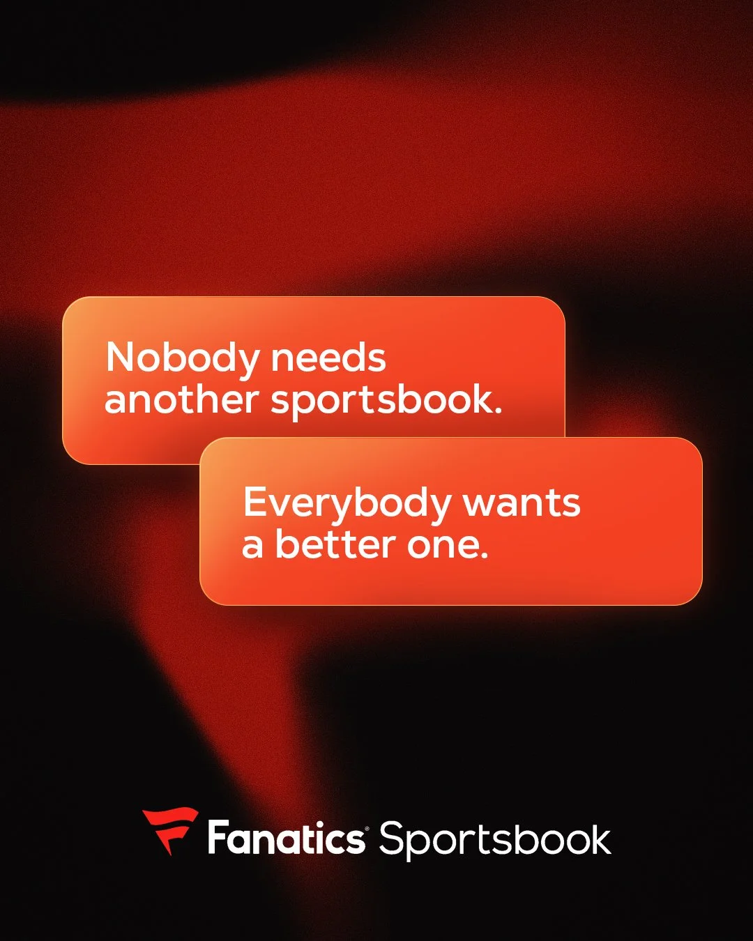
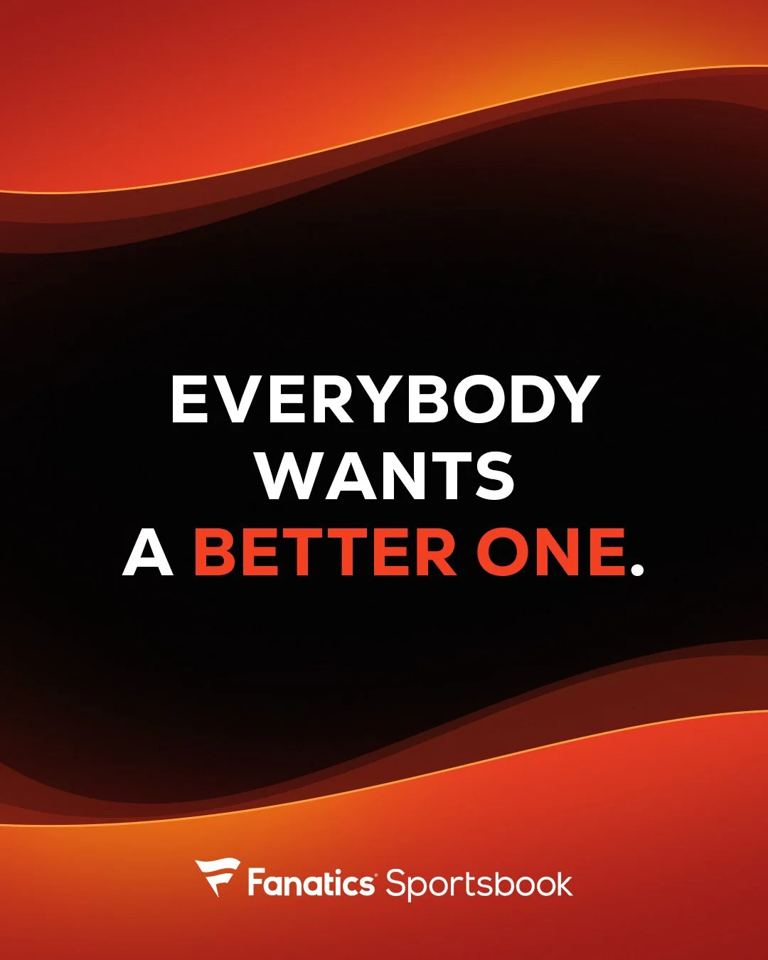
The social executions expand the system into a more modular and expressive space. Message beats are broken into dynamic layouts that play with hierarchy, pacing, and motion, allowing the copy to unfold across posts and formats. UI-inspired elements, stacked typography, and animated transitions add energy and interactivity while maintaining brand consistency. This approach allows the campaign to live naturally within social feeds, delivering the same bold statement in a more playful, scroll-stopping way.
Option 1 : Single Post
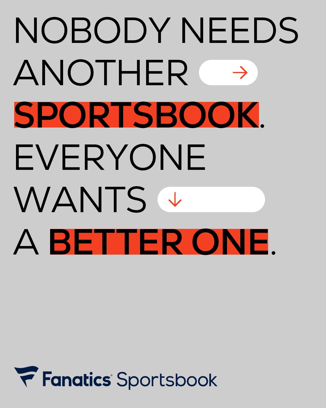
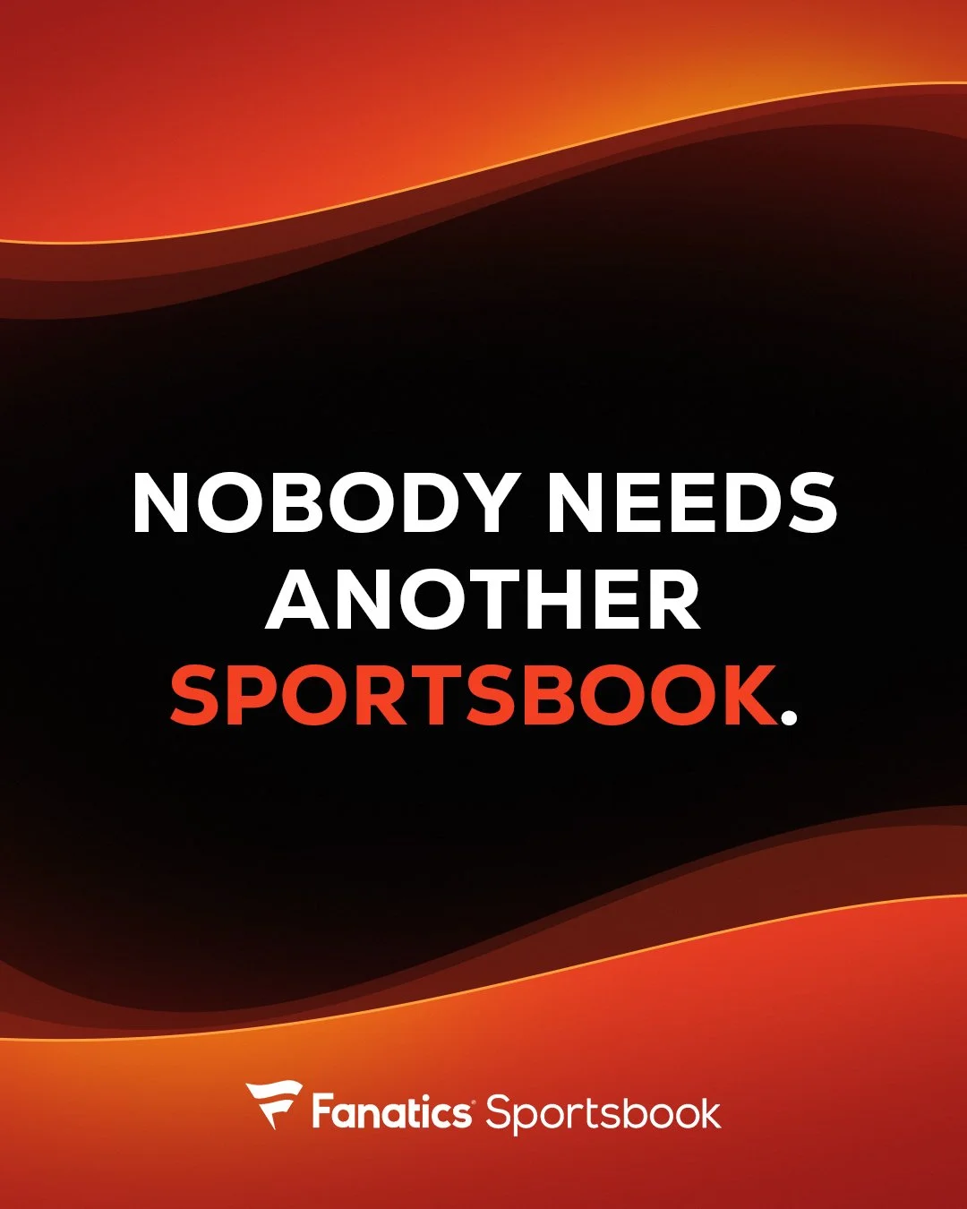
Option 2 : Sequence Post
Option 3 : Sequence Post