Quarterback
Netflix
Designer
The design language for Quarterback was built to feel grounded, immediate, and human, mirroring the intensity and intimacy of life inside the NFL. Rather than leaning into flashy sports tropes, the approach focused on restraint and authenticity, allowing typography and composition to support the emotional weight of the stories being told. Every design decision was meant to feel purposeful, letting the players’ voices and moments take center stage.
Visually, the system balances cinematic polish with documentary honesty. Clean layouts, confident type, and subtle motion create a sense of structure, while texture, pacing, and scale shifts keep the work feeling raw and alive. The result is a flexible design toolkit that enhances storytelling without ever overpowering it.
Main Title Type Exploration
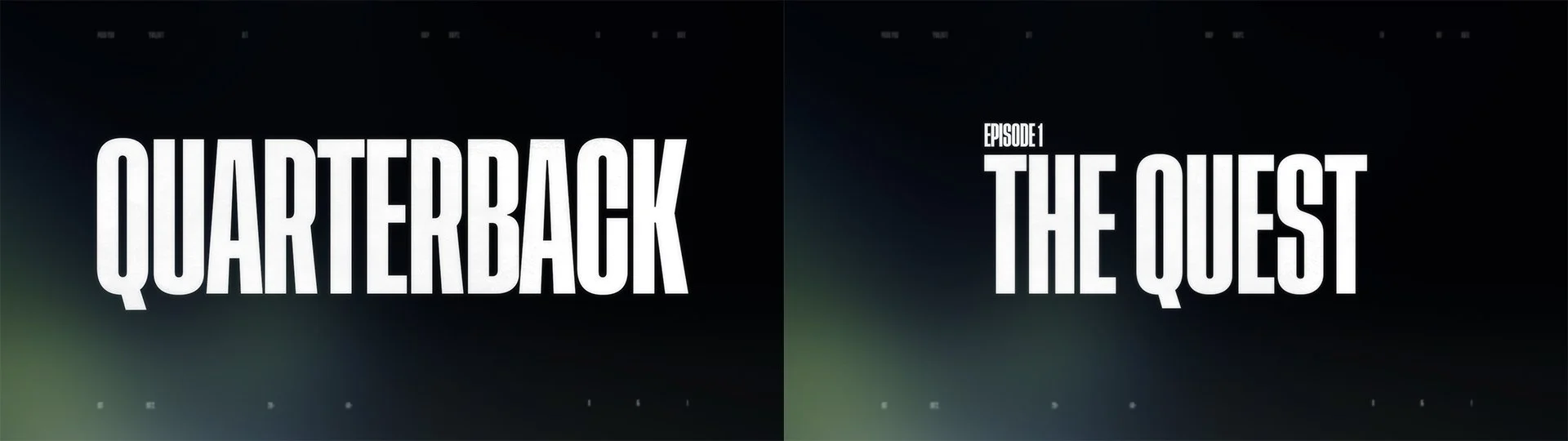
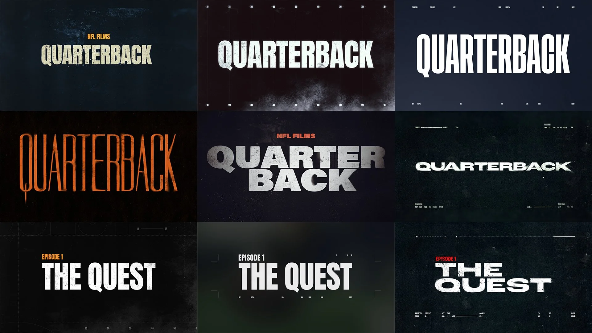
The main title typography explores bold, condensed letterforms with a strong sense of weight and presence. Type is treated as a graphic element, using scale, spacing, and timing to build tension and rhythm, much like the game itself. Motion is deliberate and controlled, allowing each word to land with impact while maintaining a premium, cinematic feel that sets the tone for the series from the first frame.
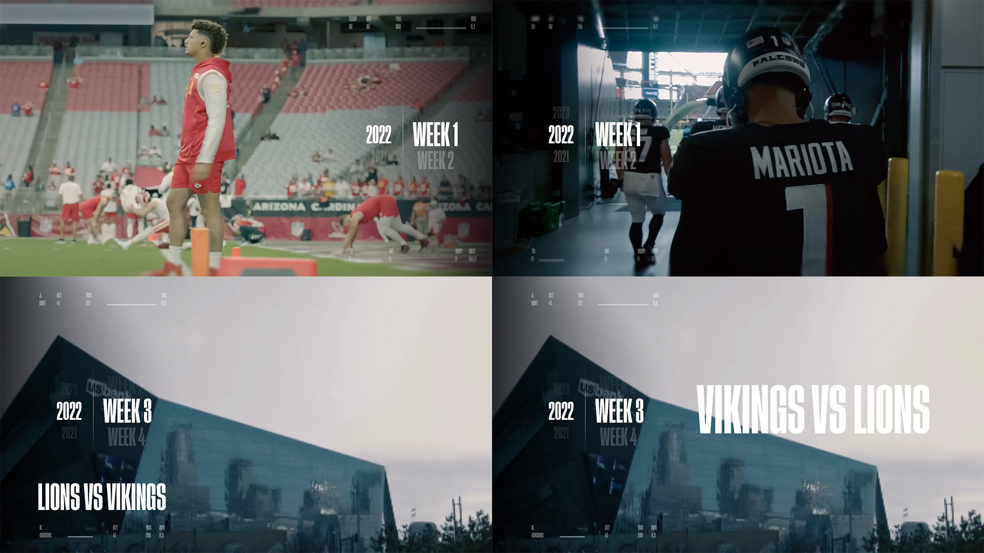
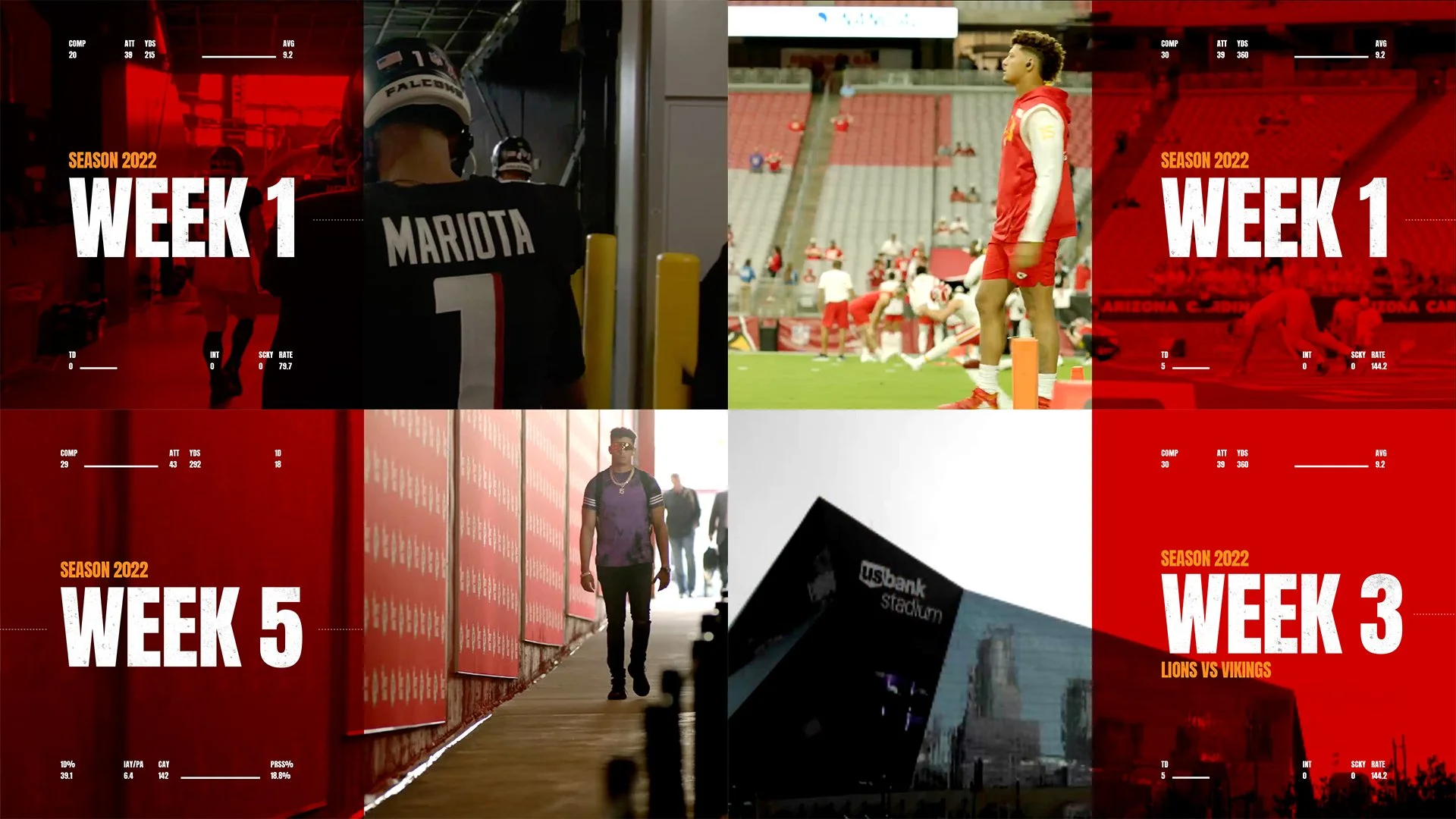
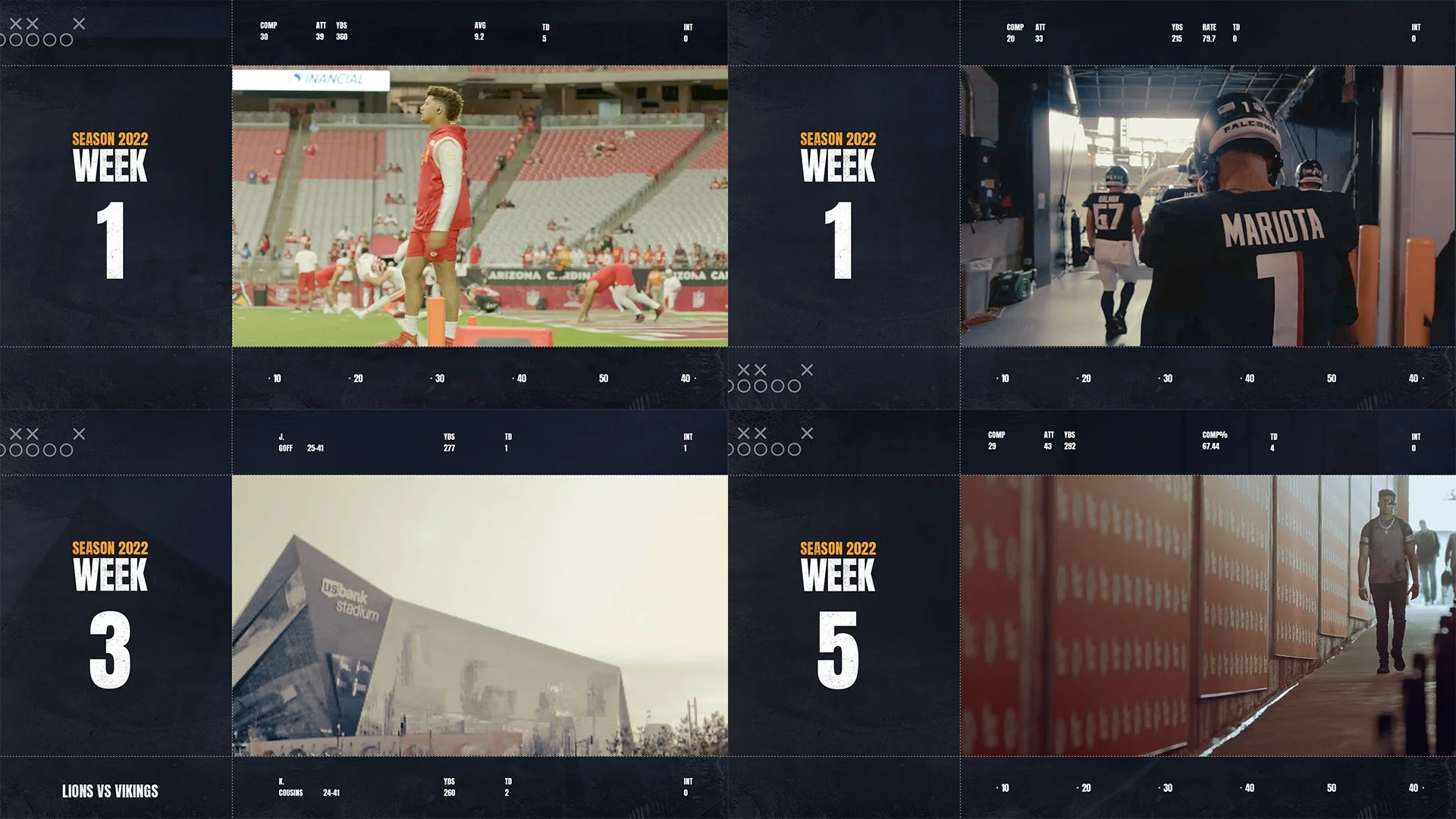
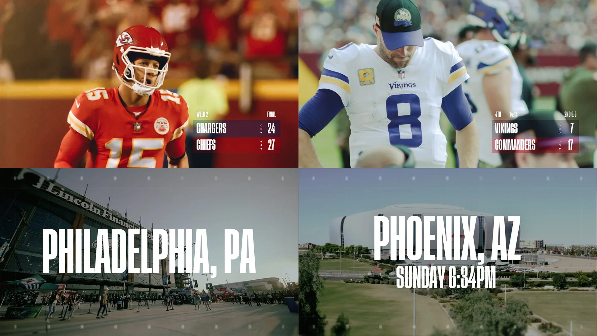
In-Show Graphics Exploration
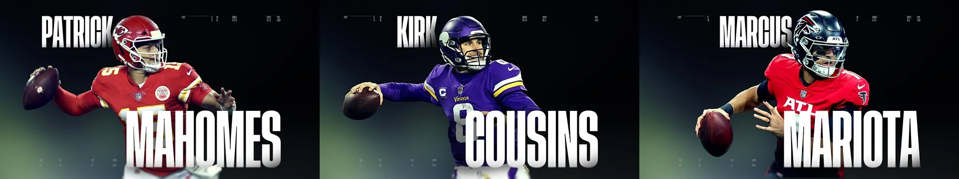
In-show graphics, including dates, locations, and player names, were designed to be clear, functional, and seamlessly integrated into the footage. Multiple visual treatments were explored, ranging from minimal, understated callouts to more assertive typographic moments when emphasis was needed. Each variation maintains consistent typography and motion principles, ensuring readability while adapting to different narrative beats, environments, and emotional moments throughout the series.